Design comparison
SolutionDesign
Solution retrospective
is my code OK?
Community feedback
- @Enmanuel-Otero-MontanoPosted over 2 years ago
Hi Newbie! You have some things that can be improved
- You should have no more than one <h1> tag per page. You have two.
- You should use as much as possible tags that make semantic sense instead of <div> ( header, section, footer, etc ).
- The alt attribute always has to be present when you use the <img> tag, even if it doesn't have any content.
Marked as helpful1 - @RajSanjelPosted over 2 years ago
My suggestions:-
- Use semantic html (read here)[https://medium.com/before-semicolon/10-html-semantic-tags-and-when-to-use-them-5ae7d7d0b0f2]
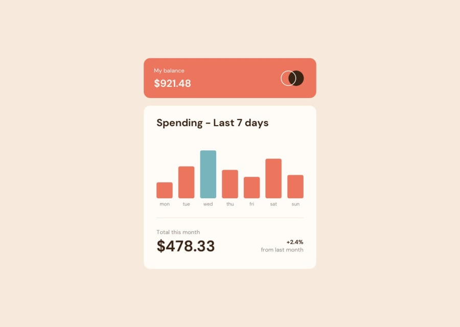
- According to challenge cyan is for current day so add logic for highlighting current day by using cyan color.
- In mobile its upper part and lower part is touching the edge. You should fix that by giving margin top and bottom or padding top or bottom.
Hope this helped.
Marked as helpful1
Please log in to post a comment
Log in with GitHubJoin our Discord community
Join thousands of Frontend Mentor community members taking the challenges, sharing resources, helping each other, and chatting about all things front-end!
Join our Discord
