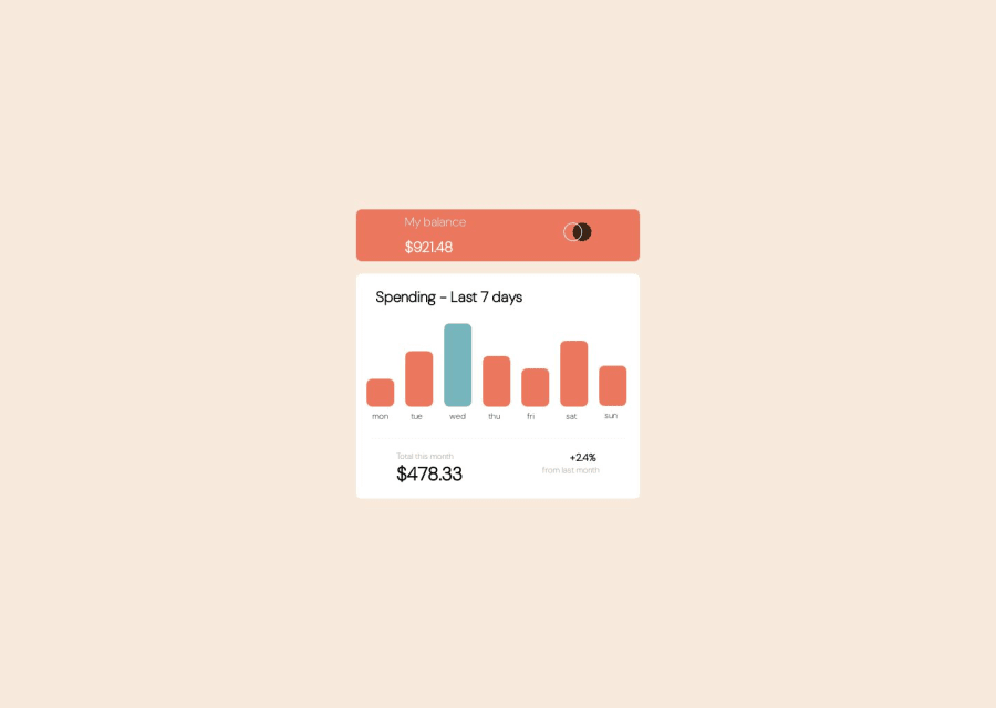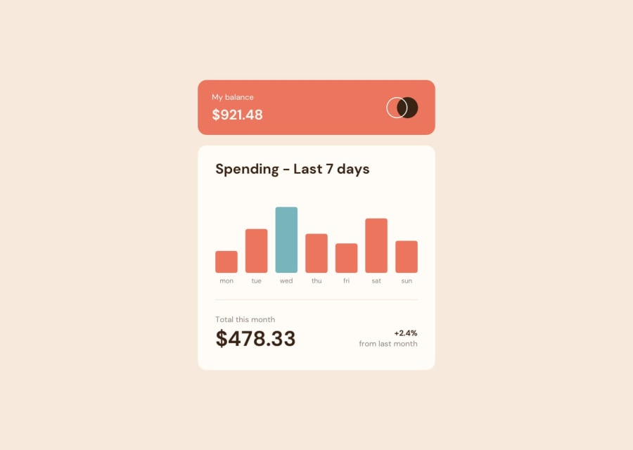
Design comparison
Solution retrospective
Any kind of feedback about the project is highly appreciated.
Community feedback
- @FanushhhPosted 11 months ago
Hello,
Your solution looks impressive on desktop devices but I believe you still have some work to do on the mobile side of thigs. For that I would recommend avoiding widths and heights on elements and work instead with *max-width" or max-height. These will make sure that your element on which you applied them grows/shrinks along with the device size.
Now onto the javascript side, there is quite a bit of code that can be reduced by selecting all columns as well as prices. I took your solution and made some quick adjustments ( these are by no means the "only way" but more like the way that I found the fastest to showcase my example). I won't really attach the css because it's barebones just to visualize the whole thing.
HTML
<body>
    <div class="head">
        <div class="value">
            <p class="name">My balance</p>
            <h3 class="num">$921.48</h3>
        </div>
        <div class="logo">
            <img src="logo.svg" alt="" />
        </div>
    </div>
    <div class="bar">
      <h3 class="heading">Spending - Last 7 days</h3>
      <div class="graph">
        <div class="column">
          <p class="amount amount1">$17.45</p>
          <button class="first"></button>
        </div>
        <div class="column" style=``>
            <p class="amount amount2">$34.91</p>
            <button class="second"></button>
        </div>
        <div class="column">
            <p class="amount amount3">$52.36</p>
            <button class="third"></button>
        </div>
        <div class="column">
            <p class="amount amount4">$31.07</p>
            <button class="fourth"></button>
        </div>
        <div class="column">
            <p class="amount amount5">$23.39</p>
            <button class="fifth"></button>
        </div>
        <div class="column">
            <p class="amount amount6">$43.28</p>
            <button class="sixth"></button>
        </div>
        <div class="column">
            <p class="amount amount7">$25.48</p>
            <button class="seventh"></button>
        </div>
    </div>
    <div class="week">
        <p class="text">mon</p>
    <p class="text">tue</p>
    <p class="text">wed</p>
    <p class="text">thu</p>
    <p class="text">fri</p>
    <p class="text">sat</p>
    <p class="text">sun</p>
    </div>
    <div class="line"></div>
    <div class="next">
        <div class="rate">
            <p>Total this month</p>
            <h2>$478.33</h2>
        </div>
        <div class="date">
            <h4>+2.4%</h4>
            <p>from last month</p>
        </div>
    </div>

</div>
Javascript
const buttons = document.querySelectorAll('button');
const columns = document.querySelectorAll('.column');


columns.forEach(column => {
    const button = column.querySelector('button');
    const amount = column.querySelector('.amount');
    let columnHeight = amount.innerHTML.substring(1);
    console.log(columnHeight)
    column.style.height = `${columnHeight}%`;

    amount.classList.remove('active');

    column.addEventListener('mouseover', () => {
        amount.classList.add('active');
    })
    column.addEventListener('mouseout', () => {
        amount.classList.remove('active');
    })
    button.addEventListener('click', () => {
        amount.classList.add('active');
    })
})
Here's also a quick codepen containing the css to help you visualize as well: https://codepen.io/Fanushhh/pen/gOqNxGP
Let me know if you have any questions about what's happening and I will answer them to the best of my knowledge. Happy coding!
Marked as helpful0@meetarora10Posted 11 months ago@Fanushhh Thank you so much for your feedback .I will definitely look and try to make my code better. Your feedback is really helpful.Thank you again for giving this valuable feedback
0
Please log in to post a comment
Log in with GitHubJoin our Discord community
Join thousands of Frontend Mentor community members taking the challenges, sharing resources, helping each other, and chatting about all things front-end!
Join our Discord
