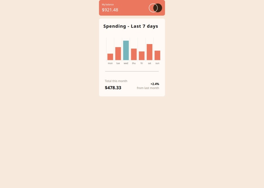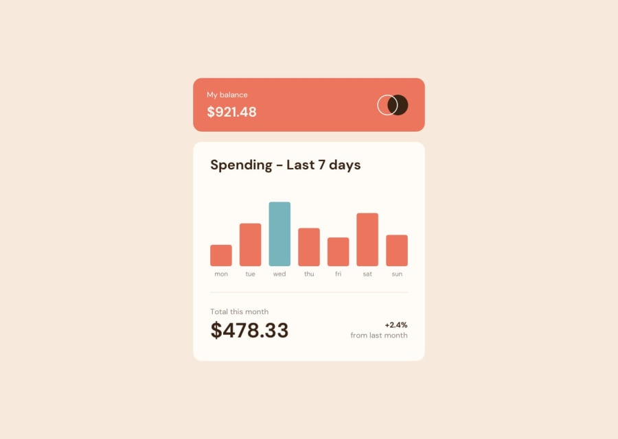
Design comparison
SolutionDesign
Solution retrospective
What are you most proud of, and what would you do differently next time?
The good point is structural way of putting css elements. The biggest success to me is to use of JS(Chart.js) framework, I know it's easiest way of doing. I will continue learning JS, to apply a better solution for this challenge.
What challenges did you encounter, and how did you overcome them?The general layout was easy. However I still struggle to properly choose the font-size for some elements for example headers. I have a feeling markup itself doesn't follow the logic, it may be confusing while reading the html file.
What specific areas of your project would you like help with?Please check my html file, and explain which logic is the best to use while creating the markup.
Community feedback
Please log in to post a comment
Log in with GitHubJoin our Discord community
Join thousands of Frontend Mentor community members taking the challenges, sharing resources, helping each other, and chatting about all things front-end!
Join our Discord
