


Design comparison

Solution retrospective
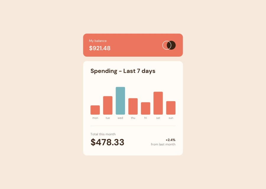
I think I overcomplicated the chart here by breaking it up into div soup, and realized late that I needed to go back and adjust things to fit on mobile. In a real project I think I'd settle on a charting library rather than make it all from scratch, but it's good to get some experience thinking about how things should scale. I chose to put an aspect ratio on the chart... it always bugs me when web figures will squish and squeeze until you can't hardly read them, so I was hoping fixing the aspect ratio would mitigate that.
Community feedback
Please log in to post a comment
Log in with GitHub
Join our Discord community
Join thousands of Frontend Mentor community members taking the challenges, sharing resources, helping each other, and chatting about all things front-end!
Join our Discord