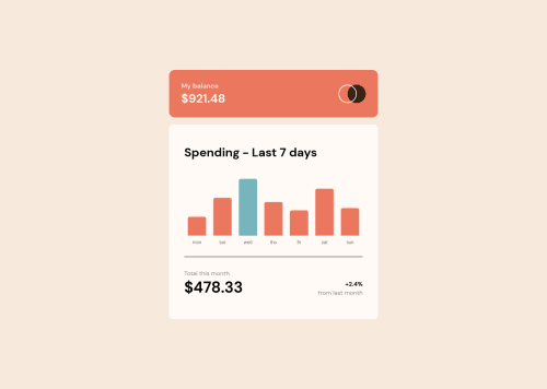
Submitted over 3 years agoA solution to the Expenses chart component challenge
Expenses chart with HTML, CSS, JS and Chart.js
chart-js, fetch
@CSamu7

Solution retrospective
The most difficult thing about the practice was making the chart, at first, I tried doing it with Canvas but it was so difficult for me, so I started to search for a library that helps me make the chart.
I'm not really sure about the HTML code and some parts of the CSS code. So I would like if someone could recommend me better practices.
Code
Loading...
Please log in to post a comment
Log in with GitHubCommunity feedback
No feedback yet. Be the first to give feedback on CSamu7's solution.
Join our Discord community
Join thousands of Frontend Mentor community members taking the challenges, sharing resources, helping each other, and chatting about all things front-end!
Join our Discord