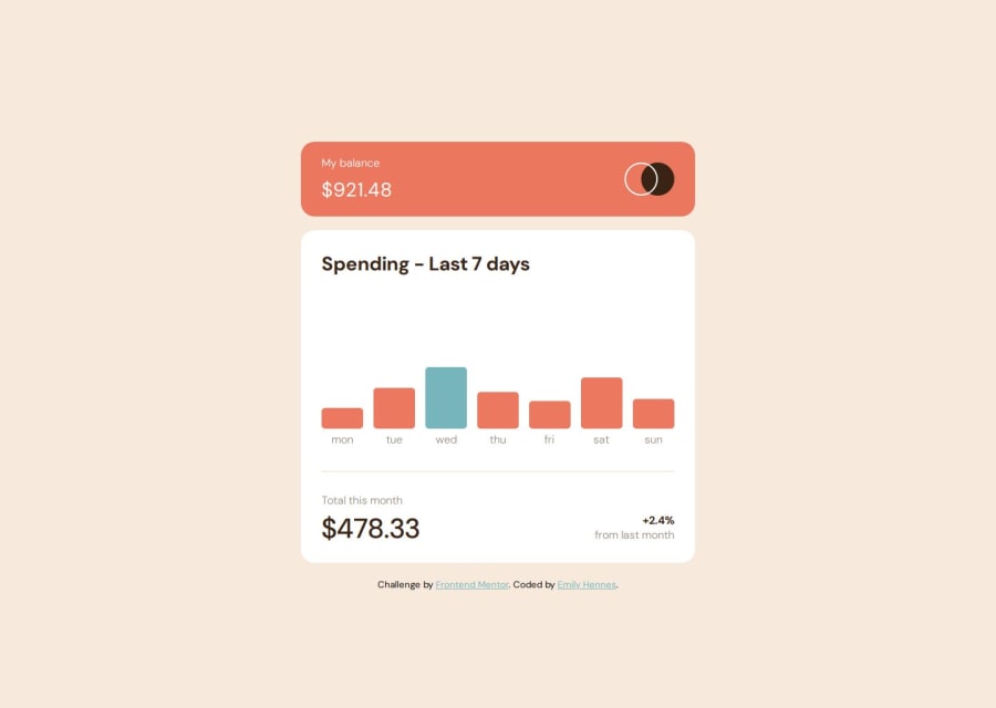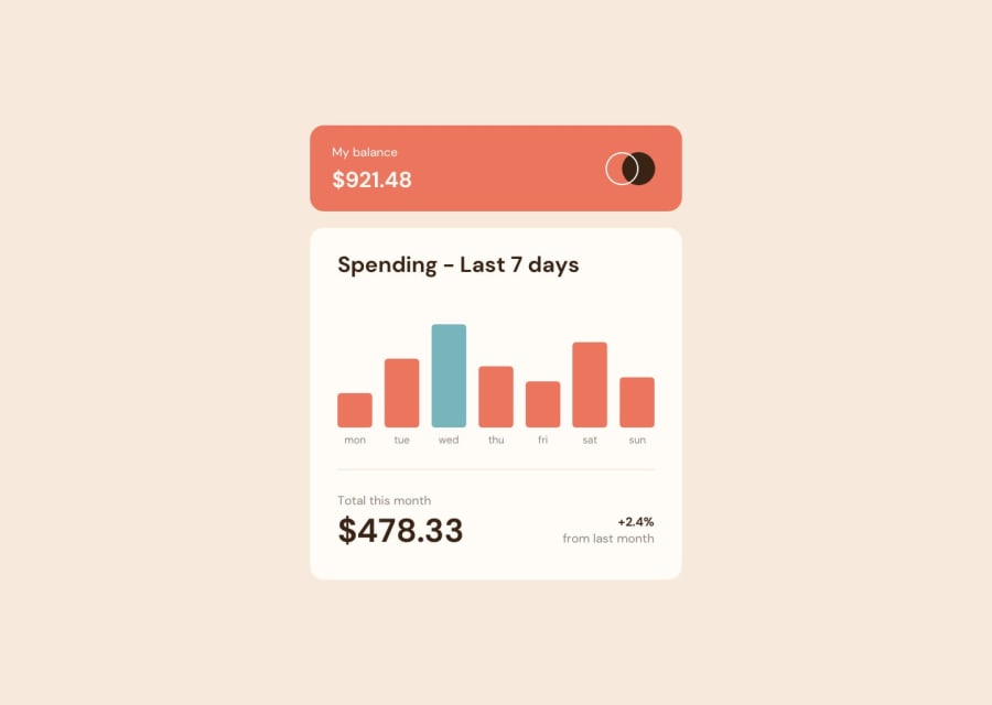
Expenses chart using scss, css grid and tippy.js
Design comparison
Solution retrospective
This was a fun design to build out! I tried out a few things during this project - I set up a server with express, used browsersync for hot reloading, ran multiple npm scripts with concurrently, and used the fetch api to pull in the data from the provided json file dynamically. For styling, I used scss and custom properties; for the graph, I used css grid and used css transitions for the movement of the bars and fading in and growing the content. I used Tippy.js for the tooltips.
I had several issues with my file structure when I went to deploy my site on Netlify, but other than that it was relatively straightforward.
Any feedback you have is appreciated!
Community feedback
Please log in to post a comment
Log in with GitHubJoin our Discord community
Join thousands of Frontend Mentor community members taking the challenges, sharing resources, helping each other, and chatting about all things front-end!
Join our Discord
