Design comparison
SolutionDesign
Solution retrospective
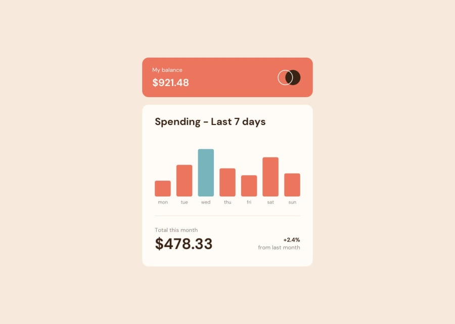
I used Flexbox to position the elements in their containers because it seemed especially convenient for things like centering the graph's bars and the bars' labels, but then also took away the "flexiness" (by specifying height and width on certain elements) so that the hover effect of displaying the amounts wouldn't cause the container to change size. My question is: Is this an okay approach? Would it better to use absolute positioning relative to a div that wraps both the bar and the amount display? Something else entirely? Thank you.
Community feedback
Please log in to post a comment
Log in with GitHubJoin our Discord community
Join thousands of Frontend Mentor community members taking the challenges, sharing resources, helping each other, and chatting about all things front-end!
Join our Discord
