Design comparison
Solution retrospective
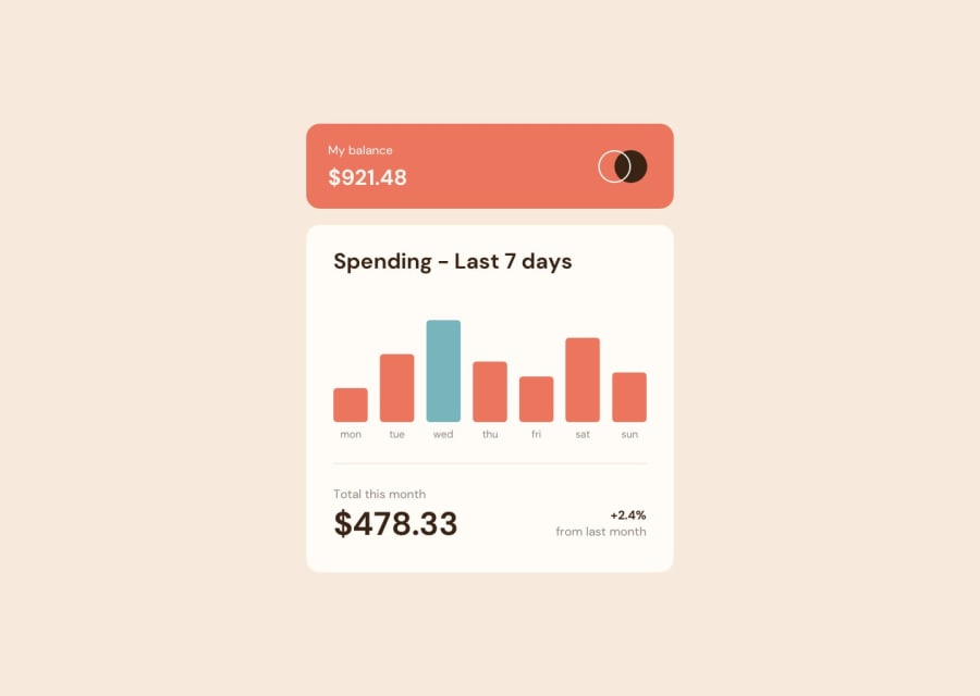
In this solution, I aimed to inject some creativity into the project by incorporating a feature where users can click on the 'Next Week' button to generate and display a new, randomized week data object within the app. Implementing this feature required deviating from the original design by substituting the term 'month' with 'week' in several places to enhance coherence and user understanding.
What challenges did you encounter, and how did you overcome them?A notable challenge posed by the design was displaying the amount of money spent in a day when hovering over the corresponding bar. However, due to the structure of the HTML where the amount div preceded the bar, employing a classic '.bar:hover .amount' approach was impractical. To resolve this issue without resorting to an external library like jQuery, I adjusted the HTML structure to make the amount div targetable on '.bar:hover' and then modified their display order in the CSS using the flex and order properties.
What specific areas of your project would you like help with?At the end of the project, I conducted some refactoring and componentization. During this process, I noticed that certain functions involving computing costs were being called too frequently, leading to unnecessary overhead. To address this issue, I implemented the useMemo hook to mitigate the extra cost incurred with each render. However, I'm unsure if there are better approaches or further optimizations that can be made to this particular codebase.
Community feedback
Please log in to post a comment
Log in with GitHubJoin our Discord community
Join thousands of Frontend Mentor community members taking the challenges, sharing resources, helping each other, and chatting about all things front-end!
Join our Discord
