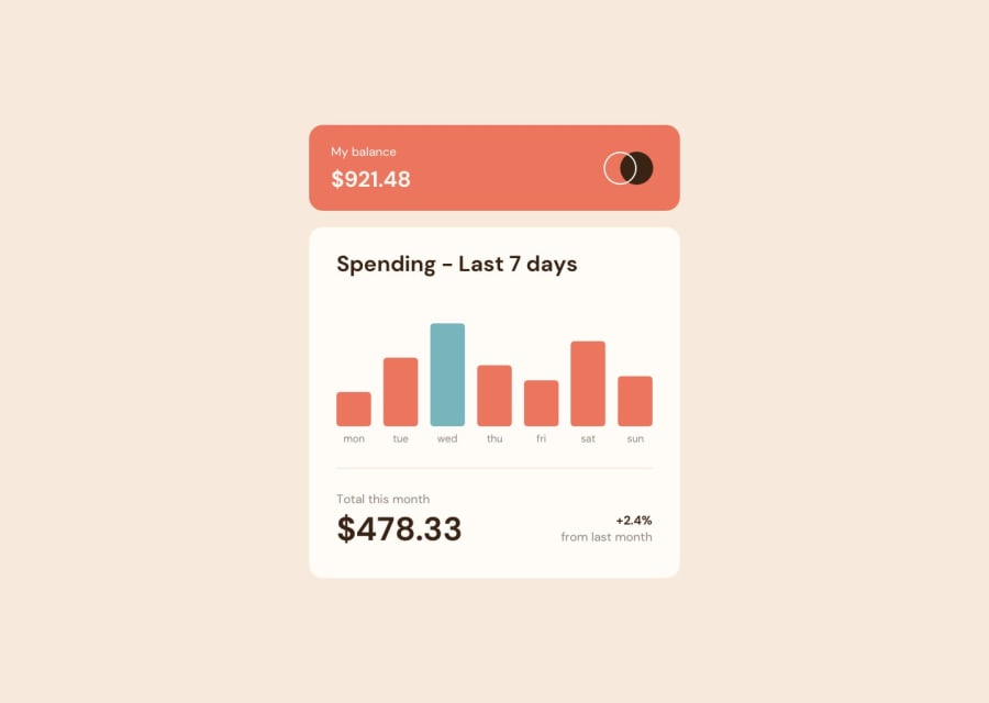
Design comparison
SolutionDesign
Solution retrospective
This is one of my first projects, if you have time please point my mistakes, so in future i will be able to make something better. I know that my scss file is a little bit messy, but as always in the begining this was the road full of failures and falls. In javascript file i tried to add few comments so it will be a little bit easier to understand what i wanted to do.
Community feedback
Please log in to post a comment
Log in with GitHubJoin our Discord community
Join thousands of Frontend Mentor community members taking the challenges, sharing resources, helping each other, and chatting about all things front-end!
Join our Discord
