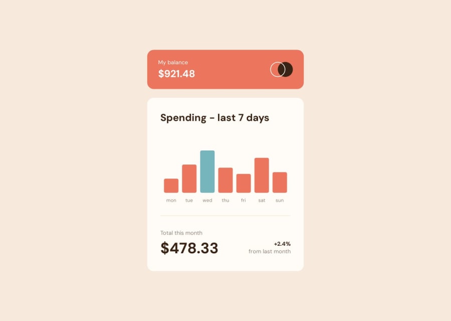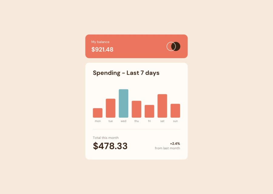
Design comparison
Solution retrospective
Very keen for any feedback on the implementation of my D3.js graph into React, or any accessibility tips for the graph that I've missed. I aimed to make keyboard navigation and SR-compatibility work well in this solution.
This was a really cool challenge that gave me an opportunity to spend some quality time with D3.js, which I've been meaning to look at for a while.
I'm also pretty proud of achieving responsive design with no media queries here - as someone who clung to media queries for all of life's device size problems while learning front-end, it's nice to finally be at a point where I'm using enough modern CSS to not require a single media query. Yay!
Community feedback
Please log in to post a comment
Log in with GitHubJoin our Discord community
Join thousands of Frontend Mentor community members taking the challenges, sharing resources, helping each other, and chatting about all things front-end!
Join our Discord
