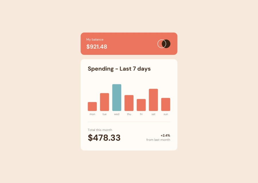
Design comparison
Solution retrospective
Hey everyone,
Had some fun with challenge.
As always feedbacks and suggestion are welcome. 😊
Community feedback
- @milandsharmaPosted about 2 years ago
hi @prabhu this is amazing work one suggestion for you you should try changing the color on click on the day bar replace it with cyan otherwise its an amazing webpage
Marked as helpful0 - @DavidMorgadePosted about 2 years ago
Hello Prabu, congrats on finishing the challenge! pretty good job with react + ts, and also, nice component tree!
The only things I think you are missing is using some semantics html tag instead of all
divs, maybe aheaderamaintag or somesectionswould fit perfectly, apart from that, since you need to have oneh1tag on your document, I would probably change the 'Spending last 7 days' from anh2tag to anh1to pass the validation.Also I would like to recommend you (based on the structure of your project) to use CSS modules, you can also use them with SCSS and it will only give you advantages, cause the structure of your project will be the same, but the classes will be scoped to components and they will prevent any type of style clash or class name repeating! Also checkout styled components that is also a great solution with CSS in JS, and they have a syntax similar to SCSS.
Hope my feedback helps you!
Marked as helpful0 - @ibra-sanPosted about 2 years ago
Congrates on completing the challenge! Superb work!
A small suggestion would be making the color of the bar changes depending on the day to show the total expenditure in that day. For example if today is Friday, then the Friday bar should be in Cyan the rest should be in orange.
Other than that, excellent work and keep on coding!
Marked as helpful0
Please log in to post a comment
Log in with GitHubJoin our Discord community
Join thousands of Frontend Mentor community members taking the challenges, sharing resources, helping each other, and chatting about all things front-end!
Join our Discord
