Submitted 5 months ago
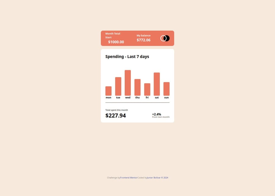
Expenses Chart Component with new JSON, Dynamically Animated JS data
@Junbol
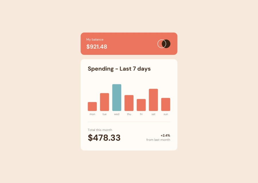
Design comparison
SolutionDesign
Solution retrospective
What are you most proud of, and what would you do differently next time?
I finally feel that all pieces are falling in place 🧩🎉🎊 ** HTML:
- Remember to add the tabindex="0" attribute to use :focus on css .
** css:
- You need to grid area you containers not the items inside your containers.
 &:hover .amount,
  &:focus-within .amount {//🚩this was the solution (-within) so the amount stay in focus after click
    opacity: 1; /* Show amount on bar hover or focus */
  }

    &:hover,
  &:focus {//🚩 There was a 🐞 here: The bar was not staying in focus: Solution: added tabindex="0" attribute in the html code.
    border-radius: 5px;
    background-color: color('cyan');
  }
** JAVASCRIPT: I took the liberty to modify the data.json file to end up with a more efficient app. All was done dynamically.
  const maxAmount = expenses.reduce((max, item) => item.amount > max ? item.amount : max, 0);//🚩When you omit the curly braces, the arrow function has an implicit return, meaning it automatically returns the result of the expression without needing the return keyword.
  //max = accumulator item= currentValue

const totalAmountSpent = expenses.reduce((accumulator, item) => accumulator + item.amount, 0); // 0 is the initial value

const barGrpElement = barElement.parentElement;//🚩the se of parentElement was the 🗝️ here
same as above
What specific areas of your project would you like help with?none
Community feedback
Please log in to post a comment
Log in with GitHubJoin our Discord community
Join thousands of Frontend Mentor community members taking the challenges, sharing resources, helping each other, and chatting about all things front-end!
Join our Discord
