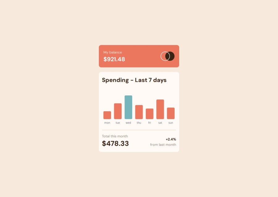
Expenses Chart Component with Chart.js and React-Chartjs-2


Design comparison
Solution retrospective
I'm proud of successfully implementing the Expenses Chart with Chart.js and react-chartjs-2, especially customizing tooltips and styling. Next time, I'd focus on optimizing the layout and spacing of the chart to ensure a smoother user experience across different screen sizes.
What challenges did you encounter, and how did you overcome them?I struggled with customizing the tooltip positioning, removing the bottom axis line, and ensuring the bars had the correct colors. I overcame these by tweaking Chart.js options, adjusting layout padding, and using conditional styling for the bars. Deployment issues also came up, but I resolved them by checking imports and ensuring dependencies were correctly configured.
What specific areas of your project would you like help with?I’d love feedback on optimizing the tooltip positioning, especially ensuring it stays centered and properly aligned for all bars. Also, any tips on improving this project would be helpful!
Community feedback
Please log in to post a comment
Log in with GitHubJoin our Discord community
Join thousands of Frontend Mentor community members taking the challenges, sharing resources, helping each other, and chatting about all things front-end!
Join our Discord