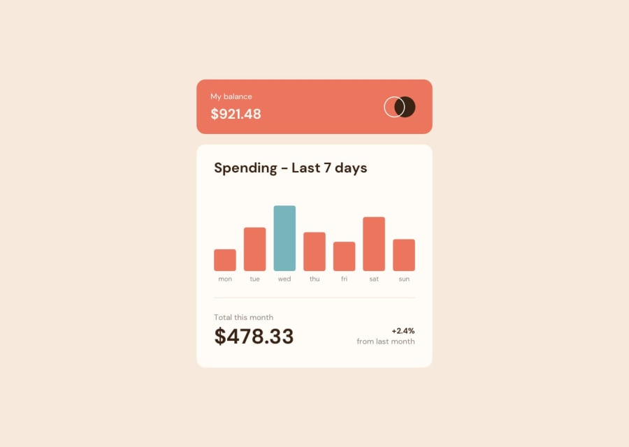
Design comparison
Solution retrospective
I'm proud of the design and that I got to learn a new library (recharts).
What challenges did you encounter, and how did you overcome them?I struggled with getting the tooltip to look like it did in the design but I was able to style it by making a custom tooltip via a function. I also struggled and failed when it came to getting the tooltip to statically stay in place above each bar.
What specific areas of your project would you like help with?I wasn't able to get the tooltip to display over each individual bar properly and if anyone knows how to do it, I'd love to read your explanation and tips! Other than that, if anyone spots any errors that I made while using Recharts, i'd love a more experienced developer to guide me in the right direction.
Thanks everyone!
Community feedback
- @KorneyChervonenkoPosted 7 months ago
Hello friend, There is a requirement in readme: “current day's bar highlighted in a different colour to the other bars”. How do you think “current day” is a some random day of week or it must be changed dynamically when page is loaded in browser? In other words “current day” is today ?
0@mikej321Posted 7 months ago@KorneyChervonenko Fixed it. I didn't notice at first that the week on the chart starts on a Monday, which is in reverse to each individual cell's index. It is fixed now though. Thanks for pointing that out.
1
Please log in to post a comment
Log in with GitHubJoin our Discord community
Join thousands of Frontend Mentor community members taking the challenges, sharing resources, helping each other, and chatting about all things front-end!
Join our Discord
