Submitted 11 months ago
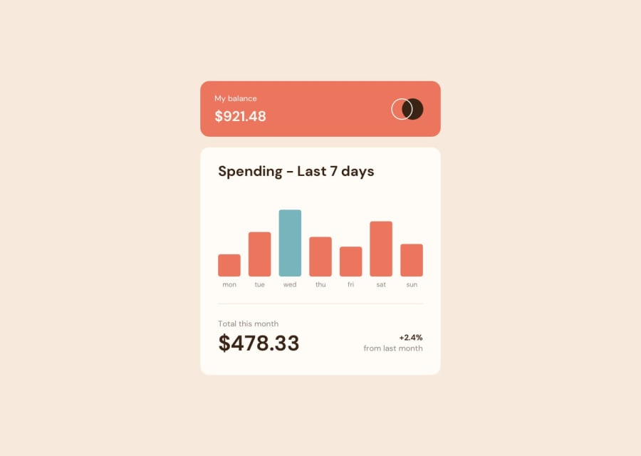
Expenses chart component using Tailwind css and Chart.js
@MundiaNderi
Design comparison
SolutionDesign
Solution retrospective
This was my first time using Chart.js and it really simplified a lot of things for me. This is the first version. In the second version I want to fix the Readme.md, create a blog post for it and maybe increase the widths of the bar graphs.
Community feedback
- @accamamuhammadPosted 11 months ago
Amazing design love the animations but instead of using a fixed height for the main component it is better to use padding, and the border-radius on you containers changes to 0 at 755px.
Marked as helpful0
Please log in to post a comment
Log in with GitHubJoin our Discord community
Join thousands of Frontend Mentor community members taking the challenges, sharing resources, helping each other, and chatting about all things front-end!
Join our Discord
