


Design comparison
Solution retrospective
What are you most proud of, and what would you do differently next time?
I love how the project can easily be modified later on without having to go over everything from scratch. It's well written and maintainable.
If I were to rebuild the project again, I'd name the components with more clarity.
What challenges did you encounter, and how did you overcome them?
It wasn't that much of a struggle, but getting the tag amounts to hover over the chart bar wasn't easy. I had no choice but to resort to absolute positioning.
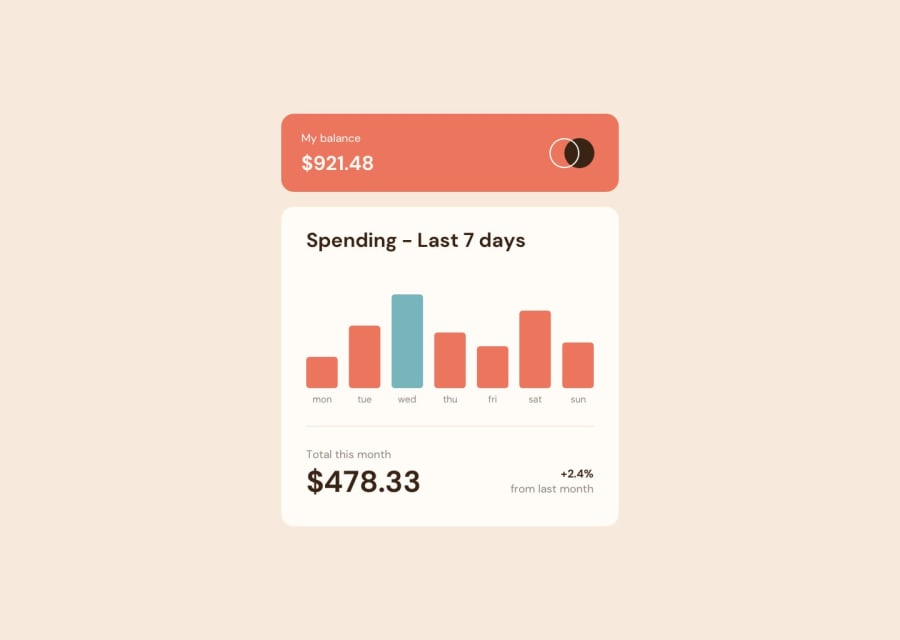
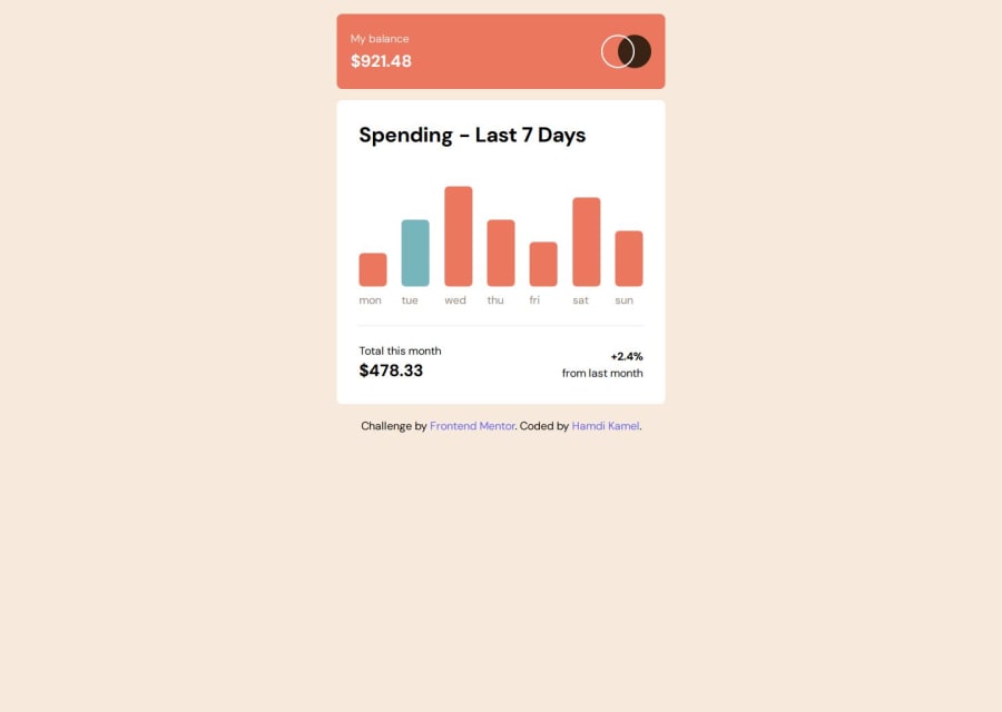
It wasn't easy to create the bar sizes based on how they look like in the design image. But I still used my best judgement.
What specific areas of your project would you like help with?
I'd love to know more about how I could've made the app more accessible by following best practices and using accessibility related properties/attributes.
Community feedback
Please log in to post a comment
Log in with GitHub
Join our Discord community
Join thousands of Frontend Mentor community members taking the challenges, sharing resources, helping each other, and chatting about all things front-end!
Join our Discord