

Design comparison
SolutionDesign
Solution retrospective
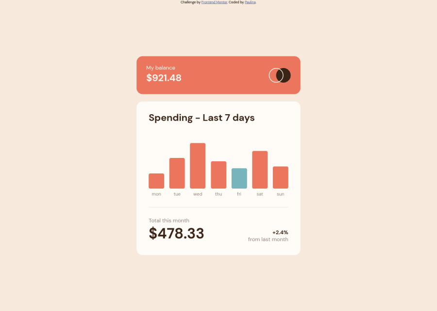
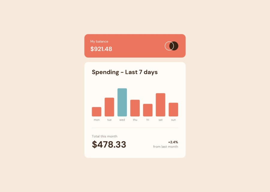
The project took me about 2 hours to complete. It is responsive - desktop and mobile version. I am a beginner with JavaScript, so this part was the most difficult for me to implement. Any feedbeck welcome :)
Community feedback
Please log in to post a comment
Log in with GitHubJoin our Discord community
Join thousands of Frontend Mentor community members taking the challenges, sharing resources, helping each other, and chatting about all things front-end!
Join our Discord