Not Found
Not Found
Not Found
Not Found
Not Found
Not Found
Not Found
Not Found
Not Found
Not Found
Not Found
Not Found
Not Found
Not Found
Not Found
Not Found
Not Found
Not Found
Not Found
Not Found

Submitted

Expenses chart component using fetch and chartjs

Tien 210

@NN-NT-TN

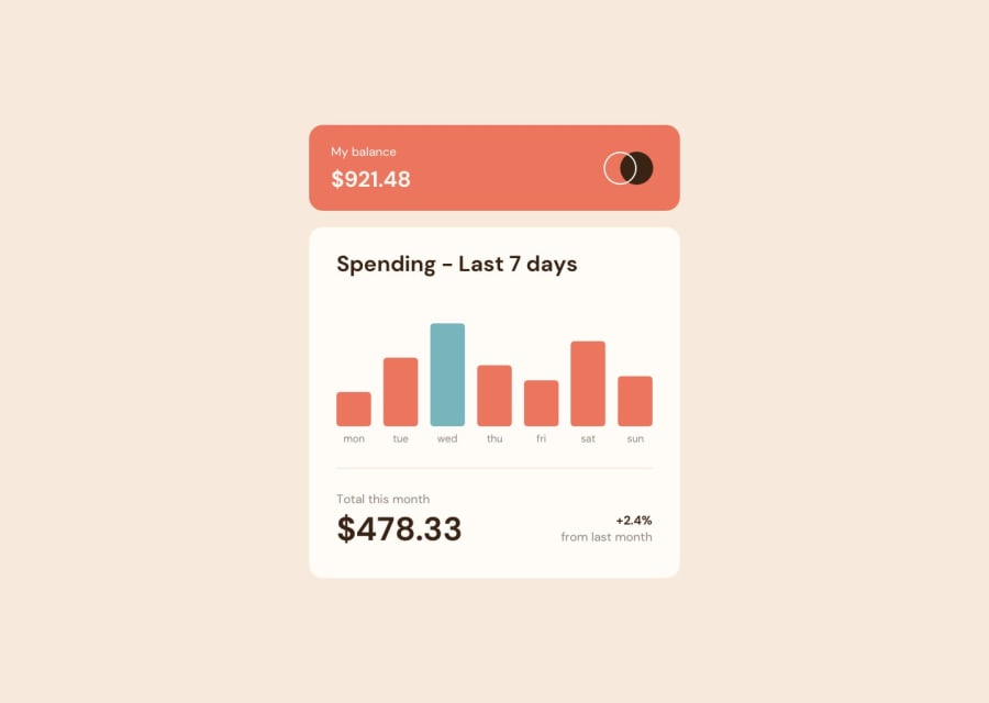
Desktop design screenshot for the Expenses chart component coding challenge

This is a solution for...

  • HTML
  • CSS
  • JS
2junior
View challenge

Design comparison


SolutionDesign

Solution retrospective


Any suggestion to make my CSS better? Is there a different way to load json aside from fetch?

Community feedback

romila 3,570

@romila2003

Posted

Hi Tien,

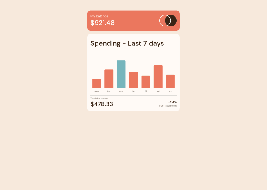
Congratulations for 🎉 for completing another challenge, the Chart component looks great, and I like that you used Chart.js, I used it too. There are some issues/suggestions want to address:

  1. Rather than using the margin properties to center the card, you can use the flex property instead e.g.
body {
  display: flex;
  align-items: center;
  justify-content: center;
  min-height: 100vh;
}
  1. You can give the border-radius to each corner of the bars through using this code borderSkipped: false,
  2. When a user hovers over the bars, the color of the bars should give it a lighter opacity which can be done through using the hoverBackgroundColor property. This can be placed under the backgroundColor property.

Overall, great work and wish you the best for your future projects so keep coding 👍.

Marked as helpful

0

Please log in to post a comment

Log in with GitHub
Discord logo

Join our Discord community

Join thousands of Frontend Mentor community members taking the challenges, sharing resources, helping each other, and chatting about all things front-end!

Join our Discord