Design comparison
Solution retrospective
Enjoyed solving this challenge!. An honest feedback would be helpful.
Community feedback
- @aaron-romanickPosted about 2 years ago
You followed the design fairly well with your CSS so that it matches the design specs on both desktop and mobile! Great!
A few things to keep in mind for next time:
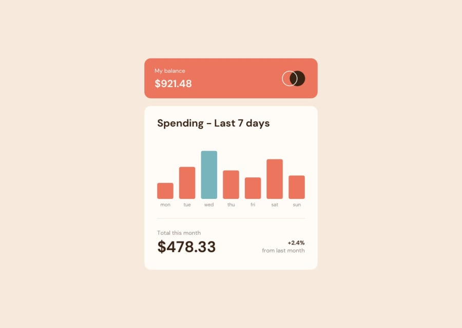
- I'm wondering why you changed the height of the bars in the spending graph. I know when you mouse over them, they change height to match the design docs, but I'm having difficulty figuring out your purpose. Also, the bars "jump" horizontally when you mouse over them so it makes it difficulty to mouse over.
- I would maybe add a
min-widthto your overall container so that at very small sizes the design doesn't break. - I'd double check your semantic use of header elements; you have an
<h2>before an<h1>, which 99.9% doesn't happen. Use your CSS to style heading tags, not the default browser styles.
0@AyoifePosted about 2 years ago@aaron-romanick I added those animations cos I wanted to spice up the project and I didn't understand what you meant by the bars jumping horizontally. But I'll take your advice and improve the solution. Thanks by the way.
0@aaron-romanickPosted about 2 years ago@Ayoife You're welcome!
Sorry I was unclear about the horizontal jumping. I took another look and I think it's when your tooltips with the price switch from
display: none;todisplay: block;when you mouse over the bars in the graph; they push the adjacent bars to the side ever so slightly to make room.0
Please log in to post a comment
Log in with GitHubJoin our Discord community
Join thousands of Frontend Mentor community members taking the challenges, sharing resources, helping each other, and chatting about all things front-end!
Join our Discord
