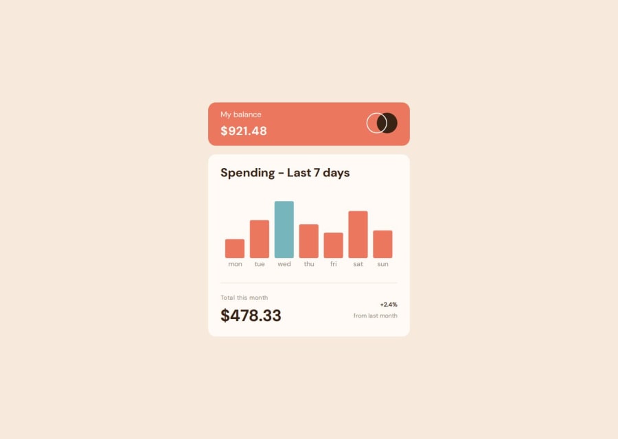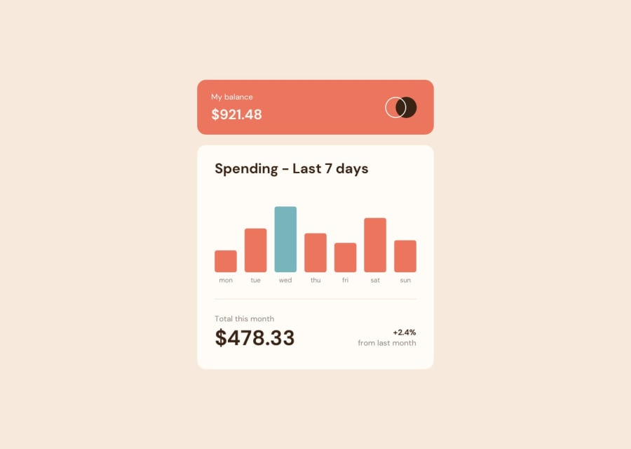
Design comparison
Community feedback
- @AdrianoEscarabotePosted 6 months ago
Hi J-D-FARFAN, hope you're doing well! I loved how your project turned out, but I’ve got a few suggestions that could be useful:
Consider using
remfor font sizes. When font sizes are set in absolute units like pixels, users can't adjust the text size based on their preferences. Relative units likeremadapt to the screen size and user settings, making them more flexible across various devices.If you'd rather keep using
px, you can download a handy VS Code extension that converts pixels toremautomaticallylink -> px to rem
Instead of using "width" to specify an absolute width, use "max-width" to specify a maximum instead. By doing this, the content will behave much more amiably in smaller resolutions, making it easier to make the project responsive.
The rest is fantastic.
Hopefully, you'll find it helpful. 👍
0
Please log in to post a comment
Log in with GitHubJoin our Discord community
Join thousands of Frontend Mentor community members taking the challenges, sharing resources, helping each other, and chatting about all things front-end!
Join our Discord
