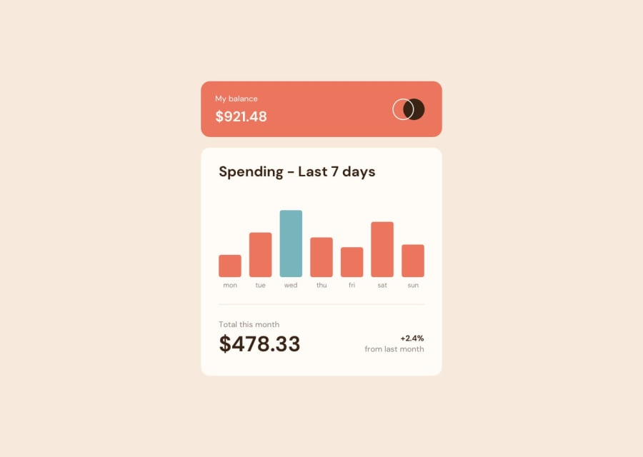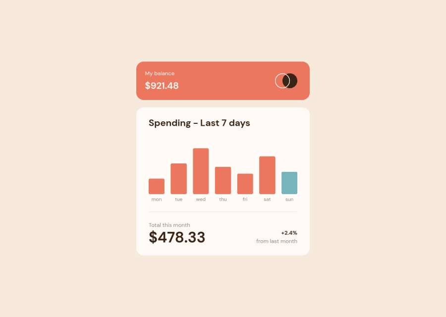
Expenses Chart Component Solution using TypeScript & CSS Grid
Design comparison
Solution retrospective
For this challenge, I decided that I didn't want to pick up any new tools, but simple hone the tools I was already a little familiar with. I decided to mess around a little more with CSS grid as I only have very basic knowledge of it at this point. I decided to "future-proof" my CSS by arranging the CSS variables in such a way that I could add a dark mode theme in the future with ease buy simply altering the color variables. I also made liberal use of the clamp
function in CSS for when screen sizes shift.
The challenge didn't call for any animation, but since the basic design wasn't too difficult I decided to add intro animations both to the bar graphs as well as the various numbers displayed. I also made sure to respect users who prefer reduced motion by respecting the prefers-reduced-motion
setting in the browser. The data is pulled into the page from a JSON file using the browser's native fetch
functionality.
If you have any feedback/comments on areas I could improve, that would be great too!
Community feedback
- @UrbanskiDevPosted about 2 years ago
Hello Aaron Romanick !
Congratulation for finishing this project
I have some suggestions to make your project better :
- The responsive of your page start to be broken for the mobile part if the screen start to be too small, I recommend you to add a min-width property, which will stop the browser to resize the specific element if the width screen is lower than the value provided.
.spending { --flow-space: var(--size-70); --padding-block: clamp(var(--size-60), 6vw, var(--size-80)); --padding-inline: clamp(var(--size-50), 6vw, var(--size-100)); background-color: var(--lm-section-spending-bg); min-width: 300px; } .balance { --padding-block: clamp(var(--size-50), 6vw, var(--size-60)); --padding-inline: clamp(var(--size-30), 6vw, var(--size-70)); background-color: var(--lm-section-balance-bg); background-image: url(/expenses-chart-component/images/logo.svg); background-position: center right clamp(var(--size-50),6vw,var(--size-100)); background-repeat: no-repeat; color: var(--lm-section-balance-text); min-width: 300px; }
I like the idea to add animations to your page, it's little details but it's add more interactivity to it ! I also like the way you structured your project, it's a good idea to structure it in order to have good habits when you start bigger projects.
Good job, and keep learning !
Marked as helpful1@aaron-romanickPosted about 2 years ago@UrbanskiDev Thank you for the excellent feedback! I totally forgot about adding a min-width! Good idea!
0
Please log in to post a comment
Log in with GitHubJoin our Discord community
Join thousands of Frontend Mentor community members taking the challenges, sharing resources, helping each other, and chatting about all things front-end!
Join our Discord