Design comparison
SolutionDesign
Solution retrospective
Hello 👋
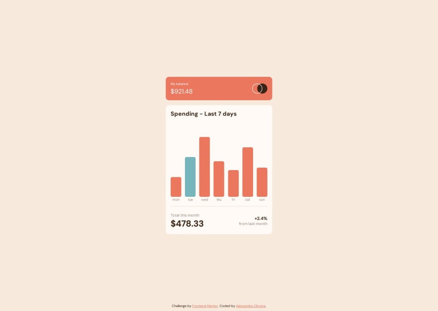
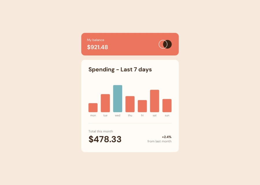
This is my solution to the expenses chart component challenge. This was my first time using an external JSON file with JavaScript, but personally I think I did a good job.
By the way (I think it's worth mentioning) I got confused at first because I thought the bar with the biggest number was suppose to be in a different color. I just realized later that the different color belonged to the bar with the current week day. I had a little trouble fixing that, but I think I succeded.
Feedbacks are welcome
Community feedback
Please log in to post a comment
Log in with GitHubJoin our Discord community
Join thousands of Frontend Mentor community members taking the challenges, sharing resources, helping each other, and chatting about all things front-end!
Join our Discord
