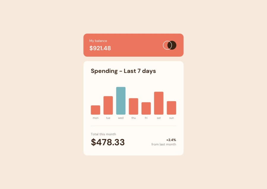
Design comparison
SolutionDesign
Solution retrospective
Hello everyone !
I did this challenge today.
It was very cool, it allowed me to train hard React and CanvasJS
However, I encountered a few small problems.
- I did not manage to make rounded edges for the different bars
- Tooltip placement is not perfect, it always stay on top of the chart
- CanvasJS watermark is very visible ...
any suggestions or ideas for improvement are welcome :)
Community feedback
Please log in to post a comment
Log in with GitHubJoin our Discord community
Join thousands of Frontend Mentor community members taking the challenges, sharing resources, helping each other, and chatting about all things front-end!
Join our Discord
