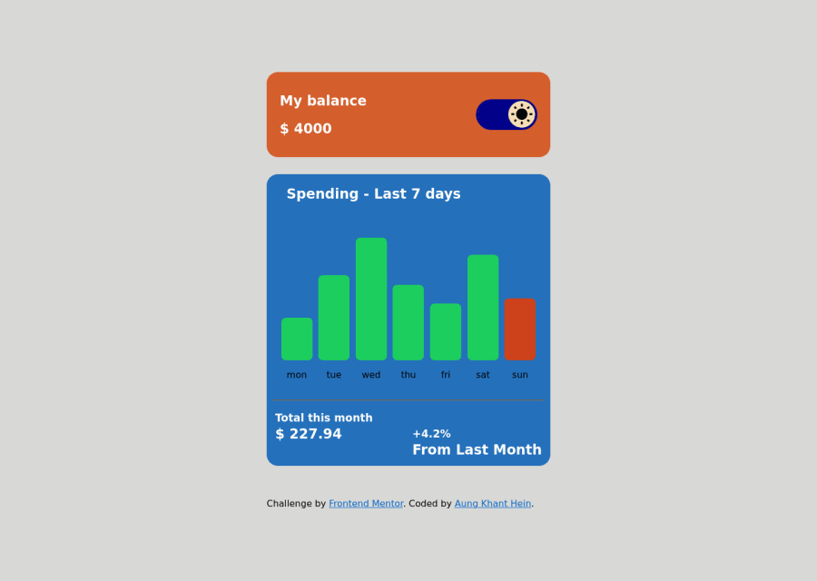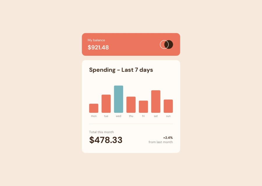
Design comparison
Community feedback
- @KhantMin200Posted over 2 years ago
Using <i> frame is very intelligence. I didn't think it before when I'm doing the same pj. Nice! And I want to suggest you is you should use CSS property 'height: 100vh; // vh --> viewport height' to center main container in every screen. In my laptop screen your pj header is cover by tabs!!! But finally to think over, you did the best bro. 🤍
Marked as helpful1 - Account deleted
Responsive is neat . Dark-Light mode click design seems pretty cool than given design. 🖤
Marked as helpful1 - @coding-tomatoPosted over 2 years ago
Hello!
Maybe instead of using media queries for different pixel sizes, you could use this line of code
width: clamp(375px, 100%, 450px)There would need to be some adjustment, but it could help you reduce boilerplate code.
Marked as helpful0@AungKhantHein314Posted over 2 years ago@coding-tomato That's really helpful. Thanks
0
Please log in to post a comment
Log in with GitHubJoin our Discord community
Join thousands of Frontend Mentor community members taking the challenges, sharing resources, helping each other, and chatting about all things front-end!
Join our Discord
