Submitted almost 2 years ago
Expenses Chart Component Main (SASS and JS)
@LysitheaDarkKnight
Design comparison
SolutionDesign
Solution retrospective
Hello, I have completed this exercise!
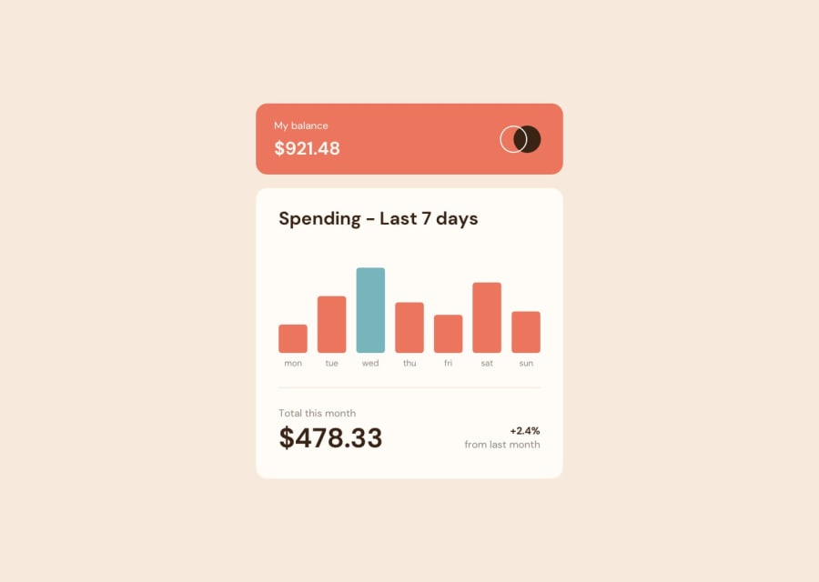
Styling with SASS wasn't too hard, though I haven't been able to center the spent__amount siblings at baseline properly, as in they're not in the same line. How can I achieve that?
I used Chart JS API to create bar chart for this exercise. I have 2 design problems I haven't solved:
-
How to get the tooltip to appear above the bars instead of being on the side?
-
How to remove the horizontal line below the bars?
Thank you for reading, any feedback is appreciated!
Community feedback
Please log in to post a comment
Log in with GitHubJoin our Discord community
Join thousands of Frontend Mentor community members taking the challenges, sharing resources, helping each other, and chatting about all things front-end!
Join our Discord
