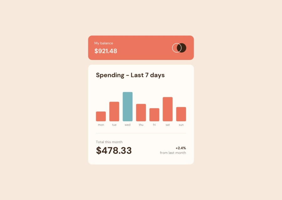
💹Expenses chart component | JSON | Animation | Dynamic | TailwindCSS
Design comparison
Solution retrospective
Hello All,
I have a question and a favor to ask. The question is in the mobile version when the screen is narrow, the contents of the chart stop getting narrower and therefore they are not staying on the screen. Do you see any solution for that?
And the favor to ask is, for an unknown reason to me, Google Lighthouse gives me an error with the performance test. I will appreciate it if you can let me know if on your end you are receiving the same error, or even better if you can tell me where this error comes from.
Looking forward to all your helpful comments and reviews.
Cheers!
Community feedback
- @kimaginPosted over 1 year ago
Hello Grace,
Thank you very much for your feedback. I'm not sure if I understood you correctly but since this is just a web component and it is supposed to be used as a single module in a whole project, there won't be a need to have a
<header>or a<nav>element and in this case, I've used<main>in order to pass the bots test. All that said, SEO was not the main goal of this project and for sure you know that only using semantic HTML doe's not magically make your site crawl to the top. You need to have all your Meta data and OGs correctly set, you need to set your robot.txt file to inform the search engines which part of the site should be crawled, and quite a lot more steps which were not the purpose of this assignment.For the projects that are a full application or complete website, I am using 🚀Astro which has several integrations to convert your site to a semantic HTML such as Astro-SEO which definitely worth investigating.
I know my HTML code can be a bit intimidating since I wrote it with a bunch of Alpine JS directives (please refer to the uncompiled code on my GitHub page), but let's say If you wanted to restructure it as a component, how would you do It?
Thanks again and I will be looking forward to hearing from you again.
0 - @grace-snowPosted over 1 year ago
Hi
The animations are beautiful!
But the html on this is fairly poor I’m afraid. It’s inaccessible and i Issy breaking foundational essentials like using headings appropriately and in the correct order. Remember html semantics are extremely important to communicate the content and structure of a page. That’s what bots, search engines and assistive tech all rely on.
I recommend addressing the heading order first.
To address the chart it’s hard for me to say without inspecting and I’m away from my computer over the weekend. In these types of designs often a tabular version will be offered in addition to the table (as that’s a super easy way to present the data in an accessible way). Then text above would say there is a tabular version below. But I’ve also seen some people on here make the chart html be a table with all the correct roles and visually hidden text for the data, so that is an option
It’s worth investigating
0
Please log in to post a comment
Log in with GitHubJoin our Discord community
Join thousands of Frontend Mentor community members taking the challenges, sharing resources, helping each other, and chatting about all things front-end!
Join our Discord
