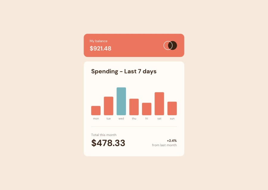
Design comparison
SolutionDesign
Solution retrospective
- I added basic error handling for data fetching.
- I don't really like how the design includes a
pointercursor on hovering the bars, because it leaves an impression that it's an interactive (clickable) element, which it isn't. That might just be my personal opinion though 😅. - Not really sure how accessibility works for charts. Using data tables seems to be an option, but i'll explore this further later.
Community feedback
Please log in to post a comment
Log in with GitHubJoin our Discord community
Join thousands of Frontend Mentor community members taking the challenges, sharing resources, helping each other, and chatting about all things front-end!
Join our Discord
