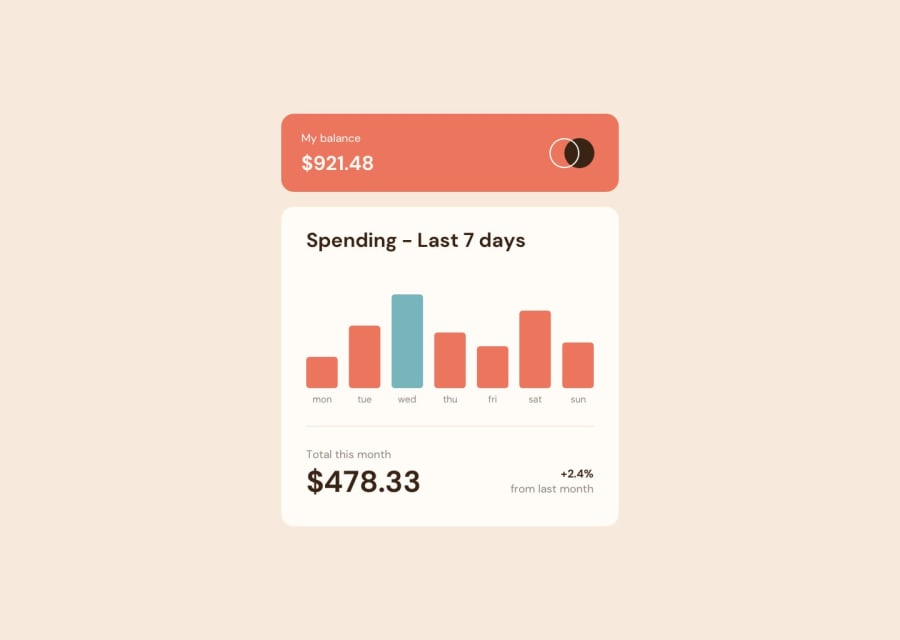
Expenses Chart Component - Dynamic chart, Accessibility, Flexbox
Design comparison
Solution retrospective
I learned more about javascript for this project, in particular, async and await. I think the code could be better using separate functions to make it more re-usable in a larger project, but it works for this small example.
I found I could make the graph work with the JSON data and include it as a table in the markup; this should make it more accessible for screen-readers while the styling makes it display like a chart -- chartscss.org was very helpful in working out how to do this.
I did find some of the styling difficult: in particular the bottom summary section because of the different type sizes, and the change between the mobile and desktop views. I found that I needed to adjust the line-heights for specific text elements which seemed a bit haphazard; perhaps it would be better to reduce line-heights to zero then use margin-top on specific elements, or maybe there is a different, more organised way of doing this?
Community feedback
Please log in to post a comment
Log in with GitHubJoin our Discord community
Join thousands of Frontend Mentor community members taking the challenges, sharing resources, helping each other, and chatting about all things front-end!
Join our Discord
