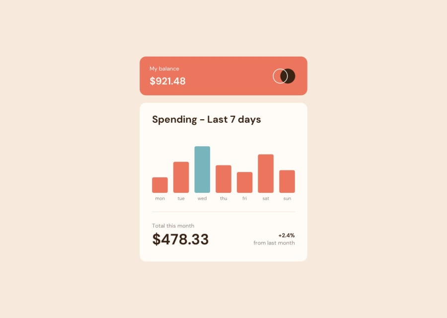
Design comparison
SolutionDesign
Solution retrospective
I missed animating the bars but I'll keep trying jeje
Community feedback
- @RajSanjelPosted over 2 years ago
Overall it looks great but you should do following things-:
- That cyan color is for current day if you read the readme carefully.
- On hovering the chart the opacity of bar should decrease a little bit(can be seen on hover effect design pic).
- The problem with price while clicking in mobile should be fixed. Image of it going beside the bar click to see the image.
- Don't keep unecessary comments in the code.
Marked as helpful1@yonathan-palmaPosted over 2 years ago@RajSanjel thanks for your comments, i will work on them
0
Please log in to post a comment
Log in with GitHubJoin our Discord community
Join thousands of Frontend Mentor community members taking the challenges, sharing resources, helping each other, and chatting about all things front-end!
Join our Discord
