Design comparison
Solution retrospective
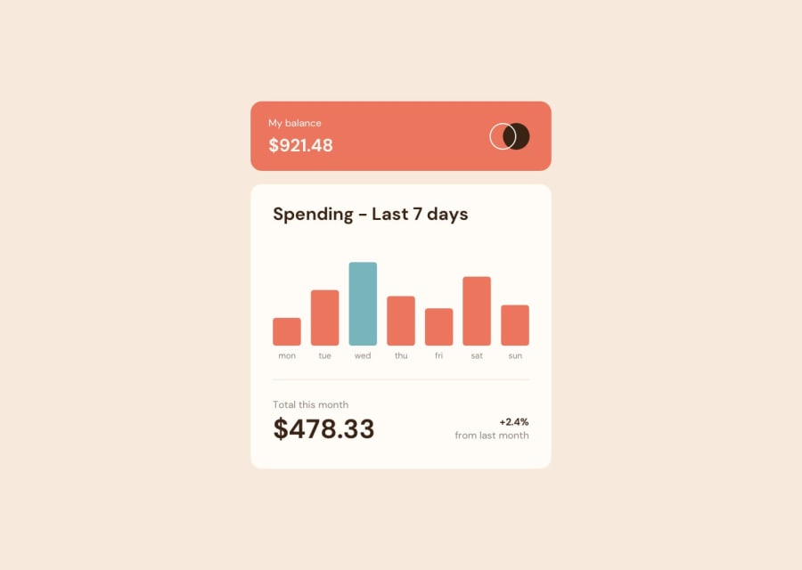
Again, my question is regarding the sizing. There was no break-point mentioned in the style-guide, but the designs show different sizes. I have assumed a break-point on my own. Is a more fluid experience expected? In which case I would have to do complicated maths and use clamp to resize everything smoothly. Is that usually expected, because it seems too much work for no utility. Is my break-point good? (min-width: 534px)
Community feedback
- @KTrick01Posted about 2 years ago
Hi! I personally use media queries just when its completely necessary, for components like this where the only thing that changes is the size of things and not the distribution I always use just clamp on the elements that need to change, clamp is not nearly as complicated as it seems, so give it an opportunity!
Marked as helpful0
Please log in to post a comment
Log in with GitHubJoin our Discord community
Join thousands of Frontend Mentor community members taking the challenges, sharing resources, helping each other, and chatting about all things front-end!
Join our Discord
