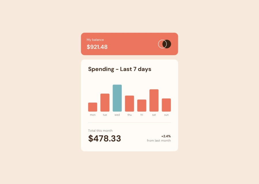
Design comparison
SolutionDesign
Community feedback
- @romila2003Posted about 2 years ago
Hi Jeremy,
Congratulations for 🎉 for completing this challenge, the Chart component looks great, and I like that you used Char.js, I used it too. There are some issues/suggestions want to address:
- Even though, you used the correct semantic for the header and the main content, you should also wrap the footer within the
footertag e.g.<footer class="attribution"></footer> - Your HTML is missing the
langattribute e.g.<html lang="en"></html> - Since you used the
sectiontag, you should include a header, anywhere betweenh2toh6.
Overall, great work and wish you the best for your future projects so keep coding 👍.
0 - Even though, you used the correct semantic for the header and the main content, you should also wrap the footer within the
Please log in to post a comment
Log in with GitHubJoin our Discord community
Join thousands of Frontend Mentor community members taking the challenges, sharing resources, helping each other, and chatting about all things front-end!
Join our Discord
