Responsive and Dynamic Expenses chart with HTML, CSS and JavaScript
Design comparison
Solution retrospective
Hi people!
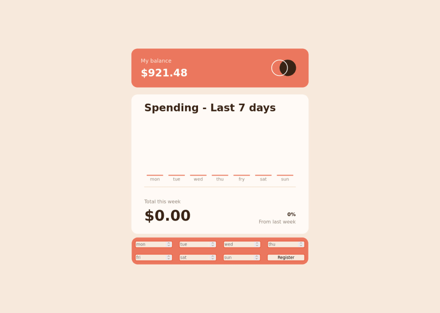
For me, this challenge was quite fun to do. I focused on doing the JS part and it was a little hard for me to start. I also learned some basic and even basic-intermediate things to complete this project, which is excellent.
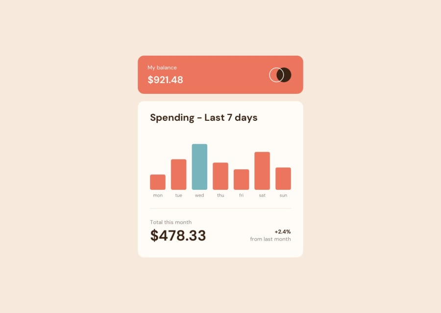
However, I have one question about an important feature for you. When you hover over the charts, a little box with the total spent on that specific day should appear. To make this I tried to use CSS pseudo-elements and change them with JS like this example:
document.getElementById("pseudoElementID").style.content = "$" + MoneySpent;
Unfortunately, it did not work and I read in some forums that it indeed can not be done the way I tried. I could just have created another div on the top of each graph and made it appear whenever the user hovered the chart but I do not want to do it like this, that's why I ask if somebody has a better way.
As always, every question and constructive criticism is welcome. Hope you all like it :)
Community feedback
Please log in to post a comment
Log in with GitHubJoin our Discord community
Join thousands of Frontend Mentor community members taking the challenges, sharing resources, helping each other, and chatting about all things front-end!
Join our Discord
