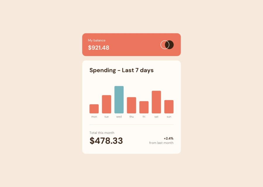
Design comparison
Solution retrospective
All Feedback is Welcome!
Community feedback
- @catherineisonlinePosted almost 2 years ago
Looks nice, don't forget to add alt="" to the image and replace instead of using div with class="attribution" use footer to get rid of report issues :))
1 - @SinisaVukmirovicPosted almost 2 years ago
Hello!
Hey, all looks good to me! JS code looks tight and clean, semantic elements in HTML and you used utility classes approach in CSS, I like that, been thinking about using those in some projects.
One thing I would change is importing of Google Fonts. It is a good practice to import fonts in the CSS. You are setting "font-family" in the CSS, right? Makes sense to import font there, too.
Ouh, and not leaving "alt" attribute empty, even when it is just for logo or icon.
All the best!
1
Please log in to post a comment
Log in with GitHubJoin our Discord community
Join thousands of Frontend Mentor community members taking the challenges, sharing resources, helping each other, and chatting about all things front-end!
Join our Discord
