

Design comparison
Solution retrospective
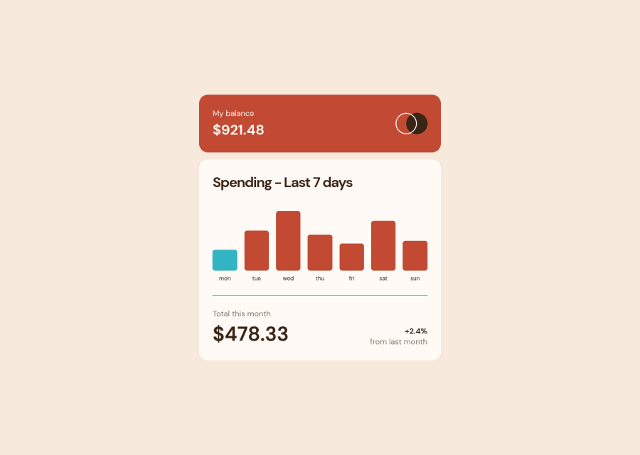
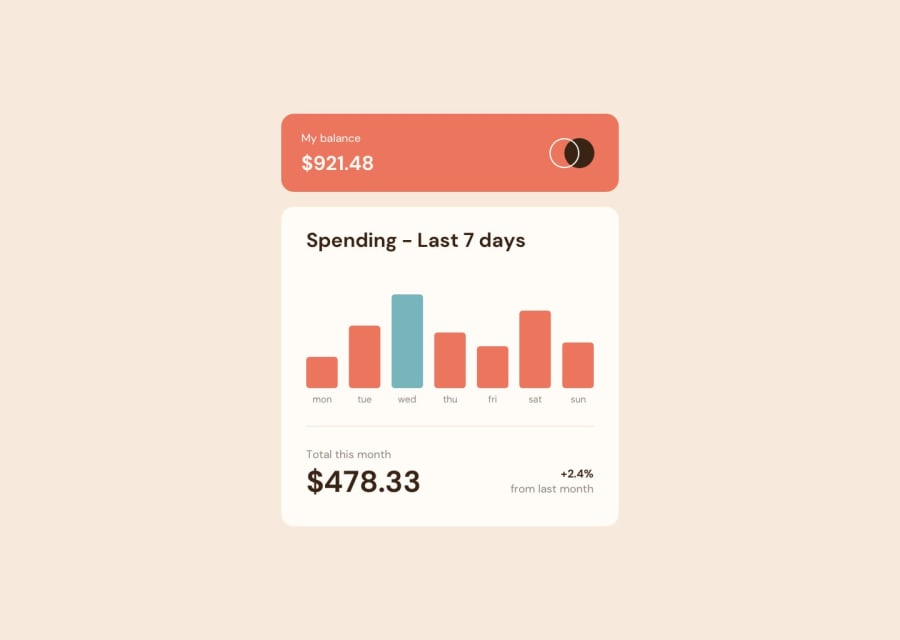
Adjusted colors for contrast. Provided functionality for mouse hover and click/tap. Took the data amounts and set bar max amount to highest value rounded up to the nearest tenth. Popup amounts are dynamic to data as well as dynamic to responsiveness. Added focus tab indexing for chart bars.
My main concern is accessibility when it comes to chart data. How can I setup accessible charts without errors/issues reported by accessibility checkers? I did try using the progress element along with label elements but was unsure how to create vertical progress bars without styling limitations/issues. Would really like to know an effective semantic approach for accessible chart data — or any chart type for that matter.
Community feedback
Please log in to post a comment
Log in with GitHubJoin our Discord community
Join thousands of Frontend Mentor community members taking the challenges, sharing resources, helping each other, and chatting about all things front-end!
Join our Discord