


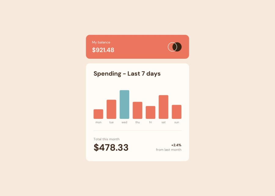
Design comparison
Community feedback
- @MachineCode0101Posted over 1 year ago
The static bars (div.bar) look great! I may add that one can achieve the same goal using rem instead of pixels; because the mobile version overflows and doesn't match the smaller screens. That can be solved by media queries for example: body { font-size: 16px; /* Default font size */ }
@media (max-width: 375) { body { font-size: 14px; /* Smaller font size for smaller screens */ } } Overall a very very clean solution!!
0@Jahan-ShahPosted over 1 year ago@MachineCode0101 Can you tell me on which device you're checking? As apparently on both desktop and mobile devices it's not overflowing.
The font sizes are already in the rem unit. So if you're not talking about font size then can you be more specific?
0

Please log in to post a comment
Log in with GitHub
Join our Discord community
Join thousands of Frontend Mentor community members taking the challenges, sharing resources, helping each other, and chatting about all things front-end!
Join our Discord