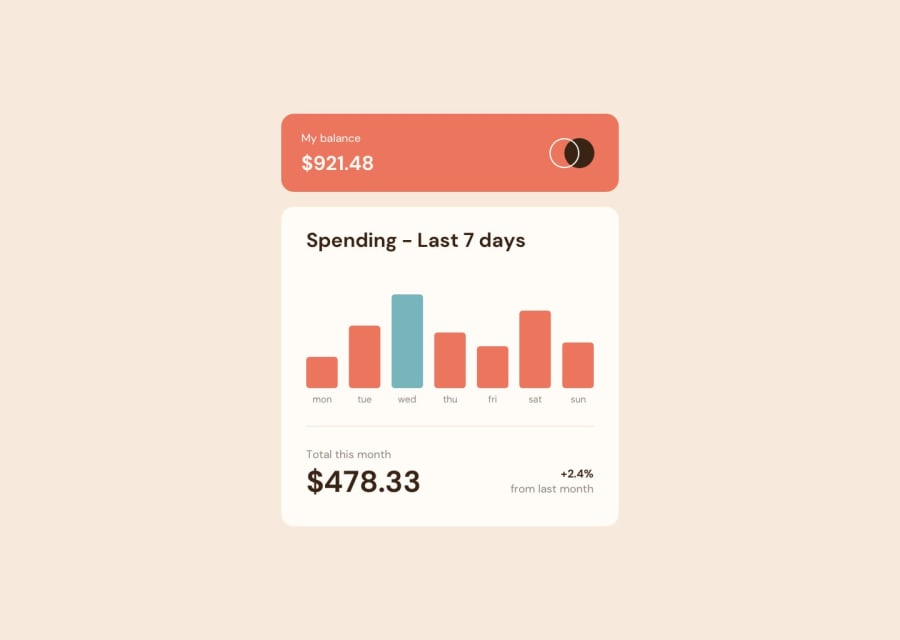
Design comparison
Solution retrospective
This was built with ChartJS. I had trouble using Version 4 of ChartJS (for some reason the chart wouldn't come on the screen) so I used Version 2 instead, which I found to be a lot more user friendly. This showed me that working with modules is something I need to work on learning how to do better.
I made the chart a little bit more dynamic by using the built-in JavaScript Date Object to make sure that the current date was always highlighted in blue. This way the bar for the current day of the week would always be highlighted.
Aside from that, please give me any feedback that you want. It is always welcome.
Community feedback
Please log in to post a comment
Log in with GitHubJoin our Discord community
Join thousands of Frontend Mentor community members taking the challenges, sharing resources, helping each other, and chatting about all things front-end!
Join our Discord
