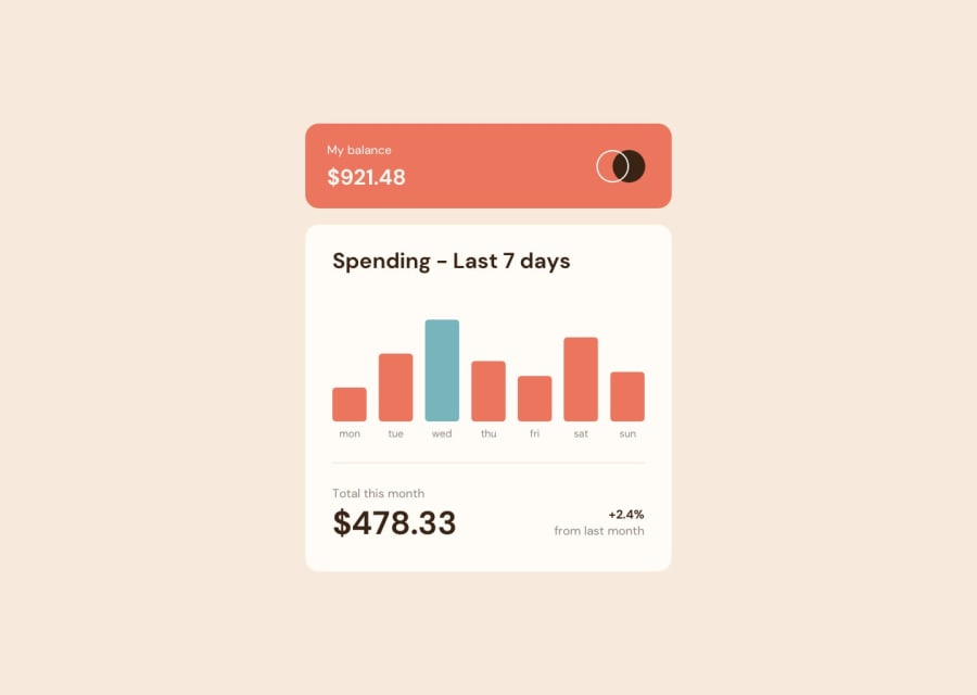
Design comparison
Community feedback
- @correlucasPosted about 2 years ago
👾Hello Filip Apatovic, Congratulations on completing this challenge!
Amazing solution as always! Here's some tips for you:
1.Use
<main>instead of<div>to wrap the card container. This way you show that this is the main block of content and also replace the div with a semantic tag.2.Use units as
remoreminstead ofpxto improve your performance by resizing fonts between different screens and devices.To save your time you can code you whole page using
pxand then in the end use a VsCode plugin called px to rem heres the link → https://marketplace.visualstudio.com/items?itemName=sainoba.px-to-rem to do the automatic conversion or use this website https://pixelsconverter.com/px-to-rem3.To reduce your css file and improve the performance loading your page you can use a tool called
css minifythat reduces the css code removing the unnecessary characters. You can use aVSCodeplugin calledminify cssor this website tool to reduce your code:https://www.toptal.com/developers/cssminifier✌️ I hope this helps you and happy coding!
Marked as helpful0
Please log in to post a comment
Log in with GitHubJoin our Discord community
Join thousands of Frontend Mentor community members taking the challenges, sharing resources, helping each other, and chatting about all things front-end!
Join our Discord
