Design comparison
Community feedback
- @gdsimoesPosted over 2 years ago
Your website looks like the design, but I would like to address a few problems to help you improve it.
I don't know if you are aware, but there is an accessibility report here on Frontend Mentor, and your solution has 13 accessibility issues. So, try to look into that first.
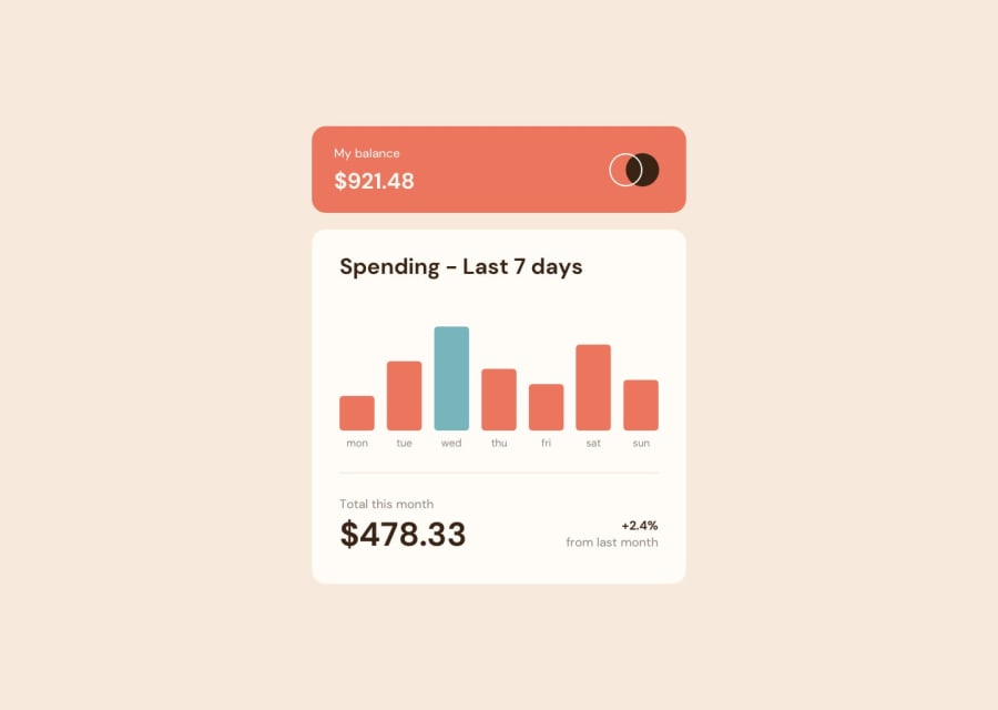
Also, the highlighted day should be today (in my case, a Friday), not Wednesday. To do that, search for the "getDay" function.
When you hover an individual bar, you get the tooltip with the correct amount, but the width of the "bar-container" increases, making the other elements move a little bit. To fix that, you should make the tooltip have the "position" property with the value "absolute." That way, it would not take part in the normal document flow, and your bars would remain static.
Finally, you implemented both the mobile and desktop designs, but as the screen gets larger, the size of your page remains the same. Ideally, it would grow or shrink according to the user's screen.
1@BrunoAgazziPosted over 2 years ago@gdsimoes Thanks Guilherme, they are very good contributions. 😉
0
Please log in to post a comment
Log in with GitHubJoin our Discord community
Join thousands of Frontend Mentor community members taking the challenges, sharing resources, helping each other, and chatting about all things front-end!
Join our Discord
