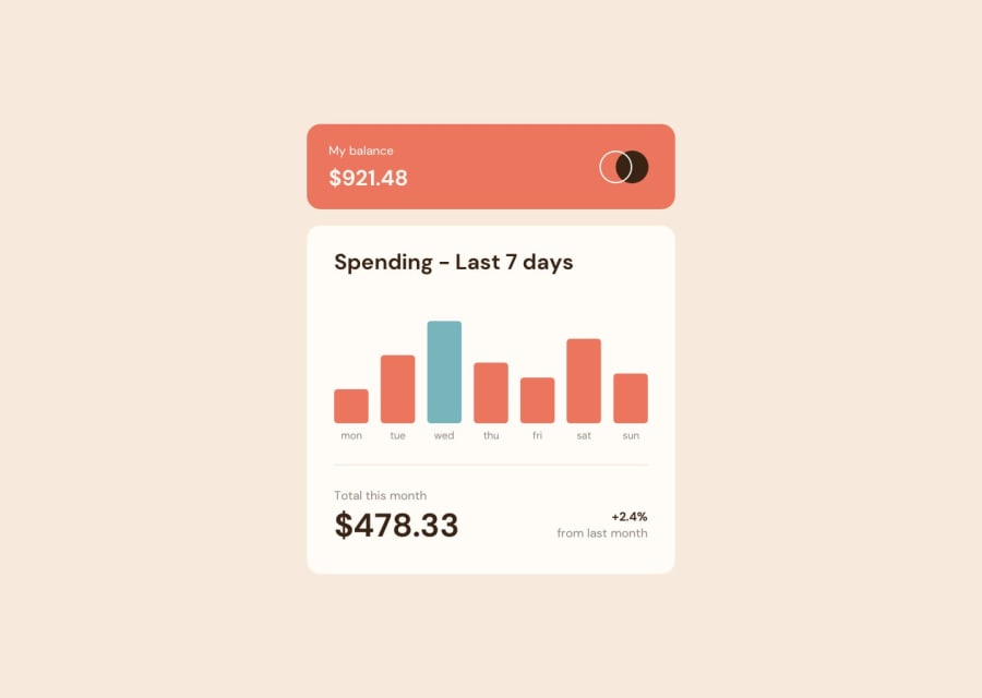
Design comparison
Solution retrospective
Not sure how to correctly resize the amount tag that pops up above the bar charts when in mobile view, currently the amount doesn't fit perfectly inside the tag box.
Community feedback
- @AdrianoEscarabotePosted about 2 years ago
Hi lgorvin, how are you?
I really liked the result of your project, but I have some tips that I think you will like:
1- Every page should have one main landmark
<main>. So replace the div that wraps the whole content with<main>to improve the accessibility. click here2- All page content should be contained by landmarks, you can understand better by clicking here: click here
We have to make sure that all content is contained in a reference region, designated with HTML5 reference elements or ARIA reference regions.
Example:
native HTML5 reference elements:
<body>
    <header>This is the header</header>
    <nav>This is the nav</nav>
    <main>This is the main</main>
    <footer>This is the footer</footer>
</body>
ARIA best practices call for using native HTML5 reference elements instead of ARIA functions whenever possible, but the markup in the following example works:
<body>
     <div role="banner">This is the header</div>
     <div role="navigation">This is the nav</div>
     <div role="main">This is the main</div>
     <div role="contentinfo">This is the footer</div>
</body>
It is a best practice to contain all content, except skip links, in distinct regions such as header, navigation, main, and footer.
Link to read more about: click here
2- Why it Matters
Navigating the web page is far simpler for screen reader users if all of the content splits between one or more high-level sections. Content outside of these sections is difficult to find, and its purpose may be unclear.
HTML has historically lacked some key semantic markers, such as the ability to designate sections of the page as the header, navigation, main content, and footer. Using both HTML5 elements and ARIA landmarks in the same element is considered a best practice, but the future will favor HTML regions as browser support increases.
Rule Description
It is a best practice to ensure that there is only one main landmark to navigate to the primary content of the page and that if the page contains iframe elements, each should either contain no landmarks, or just a single landmark.
Link to read more about: click here
Prefer to use
removerpxto have your page working better across browsers and resizing the elements properlyThe rest is great!!
Hope it helps...👍
Marked as helpful1 - @miranleginPosted about 2 years ago
Hi lgorvin,
congratulations on completing this challenge!
It seems that you have complicated life for yourself rotating the whole graph and then rotating labels itself once more. I would suggest getting rid of px based values for width and replace them with percentage or even better not using width's at all. You could for instance create a grid/flex container and separate bar charts with
column-gapand leave to the browser to decide about their respective width's.Regarding your original question about amount tag and styling it in mobile version i don't think that is necessary to try to fit text inside bubble. Better approach would be to style the bubble to fit the text only with side padding. Also the amount tag bubble is somewhat wider than bar chart so keep that in mind, you don't need to chase the same width for these two different elements.
It seems to me that you've used Tailwind or something similar so i'm not familiar with right approach using this framework but try to stick with basics and don't overthink things like rotate etc...
Keep coding! Cheers, Miran
Marked as helpful1
Please log in to post a comment
Log in with GitHubJoin our Discord community
Join thousands of Frontend Mentor community members taking the challenges, sharing resources, helping each other, and chatting about all things front-end!
Join our Discord
