Design comparison
Solution retrospective
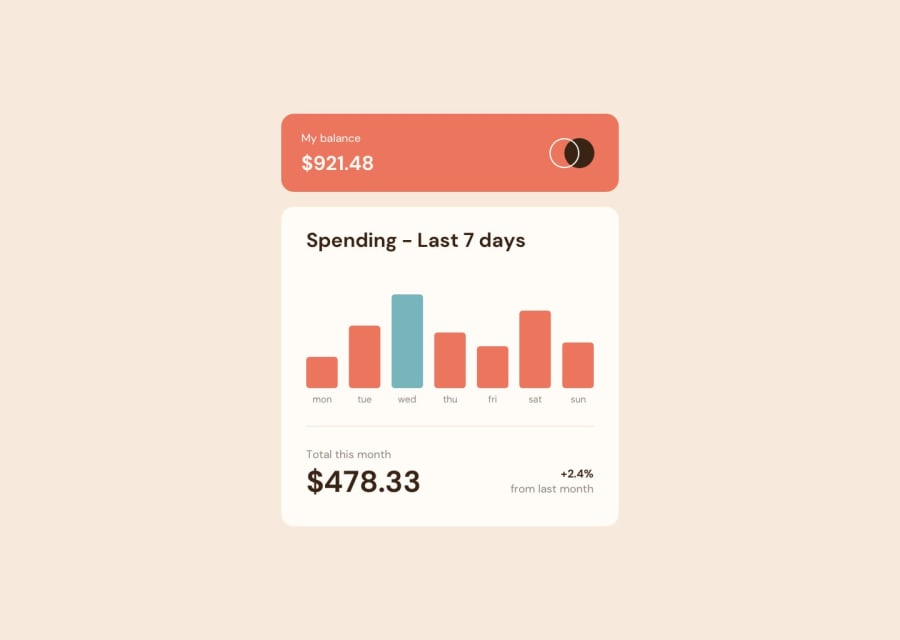
Resume: Was a very cool challenge. I have some problems with the hover states of the individual items. If you hover to fast, they stay true. Also the automatically the biggest value is marked I still have to take care of it. Instead of this everything's cool and i had much fun doing this challenge!
Happy Coding!
Community feedback
- @visualdennissPosted over 1 year ago
Congrats on completing the challenge successfully! Everything looks great and it is responsive as well. It is also great that u used json data to render their heights dynamically.
I noticed that issue with hover as well. Imho it is an overkill to use JS logic to display them on hover as they could be done with css only and using states for that overcomplicates that, not only the code but also introduces bugs as you mentioned.
If you want to see an alternative way, you can check out my solution here, where i tried to use JS for hover states at all, i only calculate the highest value to make them look blue (this is just optional tho) : Live: https://frontendmentor-showcase.netlify.app/components/expense-chart Source Code: https://github.com/visualdenniss/frontendmentorProjects/tree/main/src/components/junior/ExpChart
Hope this feedback was helpful!
0
Please log in to post a comment
Log in with GitHubJoin our Discord community
Join thousands of Frontend Mentor community members taking the challenges, sharing resources, helping each other, and chatting about all things front-end!
Join our Discord
