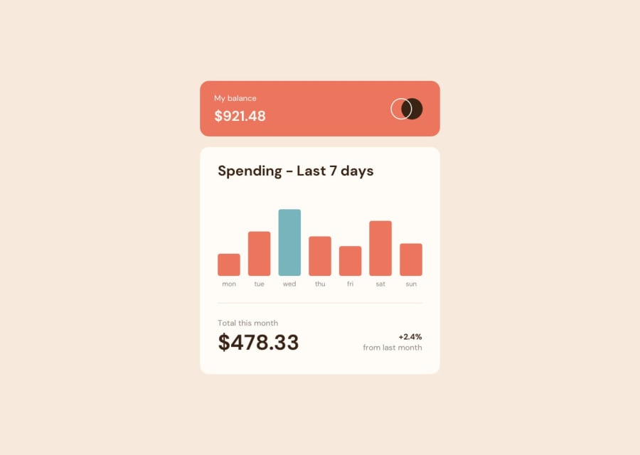
Design comparison
Solution retrospective
Hey, I am Jet Black also known as Crow🙋♂️. And this is my solution for the expenses chart challenge. 🚀
Goals Accomplished ✅:
- I was able to get better with svelte and tailwind css
- I got more practice with building dark and light modes properly
Built With🪄:SVELTEJS✔️TAILWINDCSS✔️
Overall, I really liked this challenge, and would appreciate any feedback that's given. ❤️
JetBlack12 🙋♂️
Community feedback
- @SudipKhatri036Posted over 1 year ago
I looked at your website its all good but one thing is missing and that is its responsiveness . You should focus on making the website responsive . In mobile view it doesn't show the theme changer button and the website is not fully showing in mobile screen . Happy Coding!
Marked as helpful1@Watership6Posted over 1 year agoHi @SudipKhatri036, Yes, I will definitely focus on making my websites responsive in the future. Thank you for the feedback. :)
0
Please log in to post a comment
Log in with GitHubJoin our Discord community
Join thousands of Frontend Mentor community members taking the challenges, sharing resources, helping each other, and chatting about all things front-end!
Join our Discord
