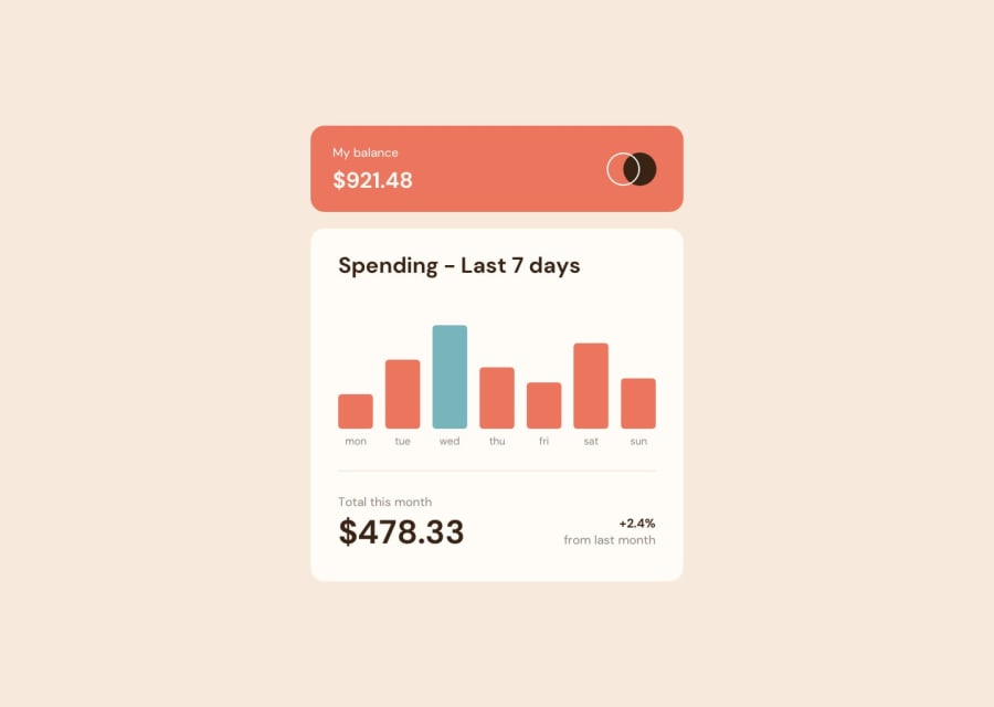
Design comparison
Solution retrospective
I did not know how the hover labels should be done and positioned.
I used absolute positioning, but I am not sure how best to center them above the bar. If there were more digits, I think they would not be centered now.
Community feedback
- @josuez2006Posted 12 months ago
Those labels are usually called tooltips and it's so simple to center them.
First, you need the container's tooltip to have the property of position relative. So then, when you apply position absolute to the tooltip, it'll be relative to its container.
Once that's done, you have to set the property left to 50% on the tooltip. In this way, it will start in the middle of the container (but hold on, it hasn't been centered yet).
Lastly, on the tooltip, write 'translate: -50%' to move the tooltip to the left and center it.
0
Please log in to post a comment
Log in with GitHubJoin our Discord community
Join thousands of Frontend Mentor community members taking the challenges, sharing resources, helping each other, and chatting about all things front-end!
Join our Discord
