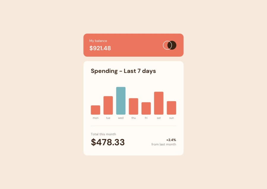
Design comparison
SolutionDesign
Solution retrospective
Please give any constructive comments like how to improve my CSS to don't repeat or reuse too much and any helpful tips! Thanks in advance!
Community feedback
- @0xabdulkhaliqPosted over 1 year ago
Hello there 👋. Congratulations on successfully completing the challenge! 🎉
- I have other recommendations regarding your code that I believe will be of great interest to you.
CSS 🎨:
- let me explain, How you can easily center the component.
- We don't need to use
marginandpaddingto center the component both horizontally & vertically. Because usingmarginorpaddingwill not dynamical centers our component at all states
- To properly center the component in the page, you should use
FlexboxorGridlayout. You can read more about centering in CSS here 📚.
- For this demonstration we use css
Gridto center the component
main { min-height: 100vh; display: grid; place-items: center; margin: 0; }- Now remove these styles, after removing you can able to see the changes
main {
    margin-top: 5vh;
}
.
I hope you find this helpful 😄 Above all, the solution you submitted is great !
Happy coding!
0
Please log in to post a comment
Log in with GitHubJoin our Discord community
Join thousands of Frontend Mentor community members taking the challenges, sharing resources, helping each other, and chatting about all things front-end!
Join our Discord
