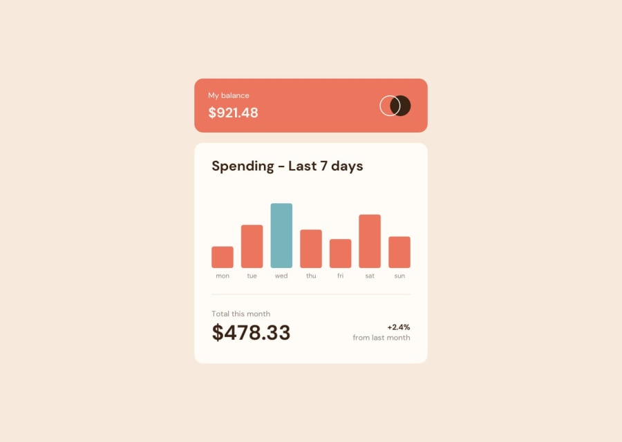
Design comparison
SolutionDesign
Solution retrospective
All the ideias are welcome.
Community feedback
- @MaikolrmPosted over 2 years ago
You did a great job... but. Pay a little more attention to containers padding to make them more simetrical. Also, the tipography on the app footer is very hard to read, you can improve the contrast by changing the color or font size. I hope this can help.
Marked as helpful0 - @jonas-nbPosted over 2 years ago
its good!!!
0
Please log in to post a comment
Log in with GitHubJoin our Discord community
Join thousands of Frontend Mentor community members taking the challenges, sharing resources, helping each other, and chatting about all things front-end!
Join our Discord
