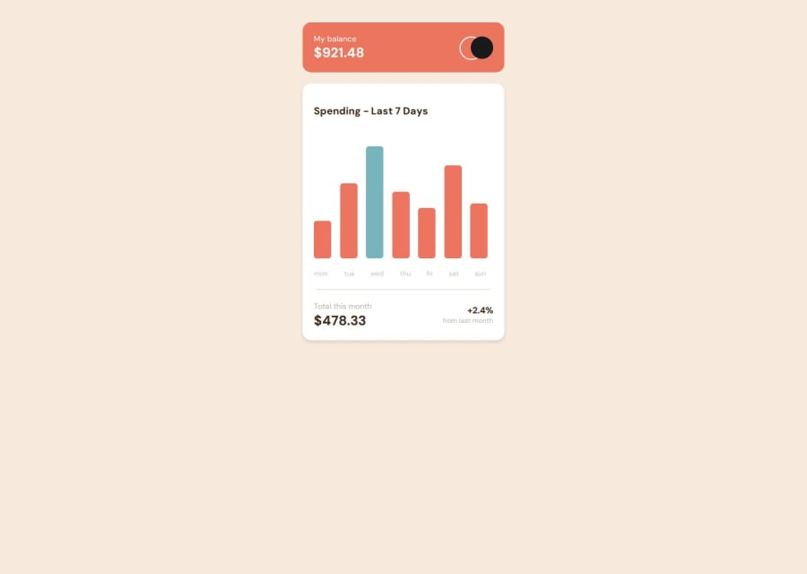


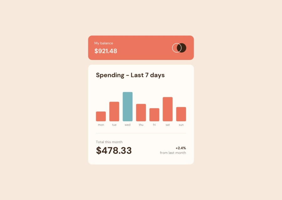
Design comparison
SolutionDesign
Solution retrospective
What are you most proud of, and what would you do differently next time?
Highlights:
- Used JS to set heights of each bar based on their amounts.
- Set a box width that works for all screens.
- Completion time was great too.
Community feedback
- P@MikDra1Posted 6 months ago
I encourage you to use this technique to make the card responsive with ease:
.card { width: 90%; max-width: 37.5rem; }On the smaller screens card will be 90% of the parent (here body), but as soon as the card will be 37.5rem (600px) it will lock with this size.
Also to put the card in the center I advise you to use this code snippet:
.container { display: grid; place-items: center; }Hope you found this comment helpful 💗💗💗
Good job and keep going 😁😊😉
0

Please log in to post a comment
Log in with GitHub
Join our Discord community
Join thousands of Frontend Mentor community members taking the challenges, sharing resources, helping each other, and chatting about all things front-end!
Join our Discord