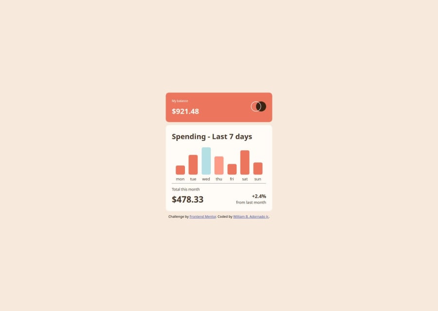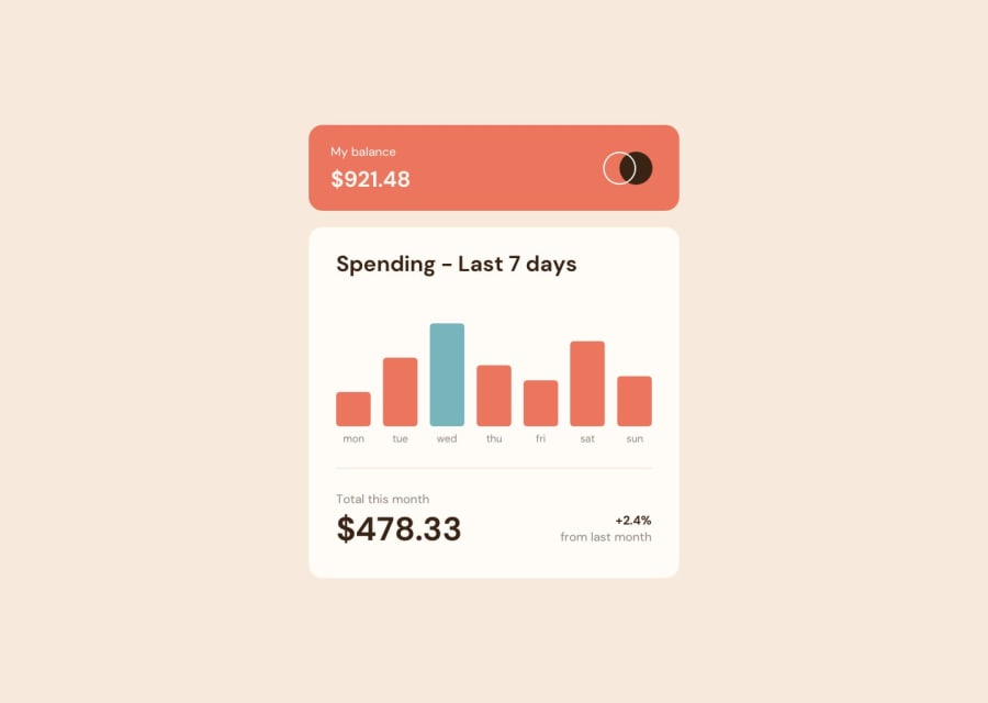
Design comparison
Solution retrospective
By doing the bar using JavaScript and not display it in html 1 by 1. Maybe I will try to do much efficient way to create an element that make more readable and understandable.
What challenges did you encounter, and how did you overcome them?By making a function when it is hovering the price of Wednesday and Thursday will appear above as if need more precision and accuracy on how to center it. And I try to overcome it by creating my own html div that has content where the use on hover the display will appear back else will hide.
What specific areas of your project would you like help with?How to center an element without using position: absolute or margin, while ensuring it fits within a fixed width?
Please log in to post a comment
Log in with GitHubCommunity feedback
No feedback yet. Be the first to give feedback on Adornadowilliam2's solution.
Join our Discord community
Join thousands of Frontend Mentor community members taking the challenges, sharing resources, helping each other, and chatting about all things front-end!
Join our Discord
