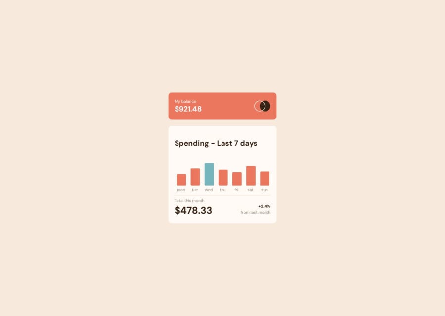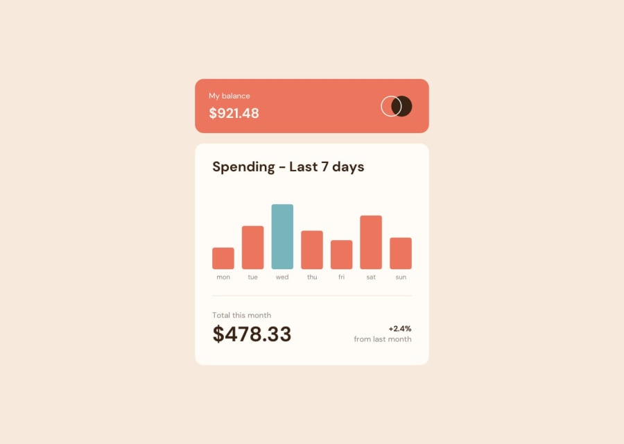
Design comparison
SolutionDesign
Solution retrospective
I don't understand why my design appears like this in the image but looks fine on the live site. i used svg rect for bars , is there any other way to do it?
Community feedback
Please log in to post a comment
Log in with GitHubJoin our Discord community
Join thousands of Frontend Mentor community members taking the challenges, sharing resources, helping each other, and chatting about all things front-end!
Join our Discord
