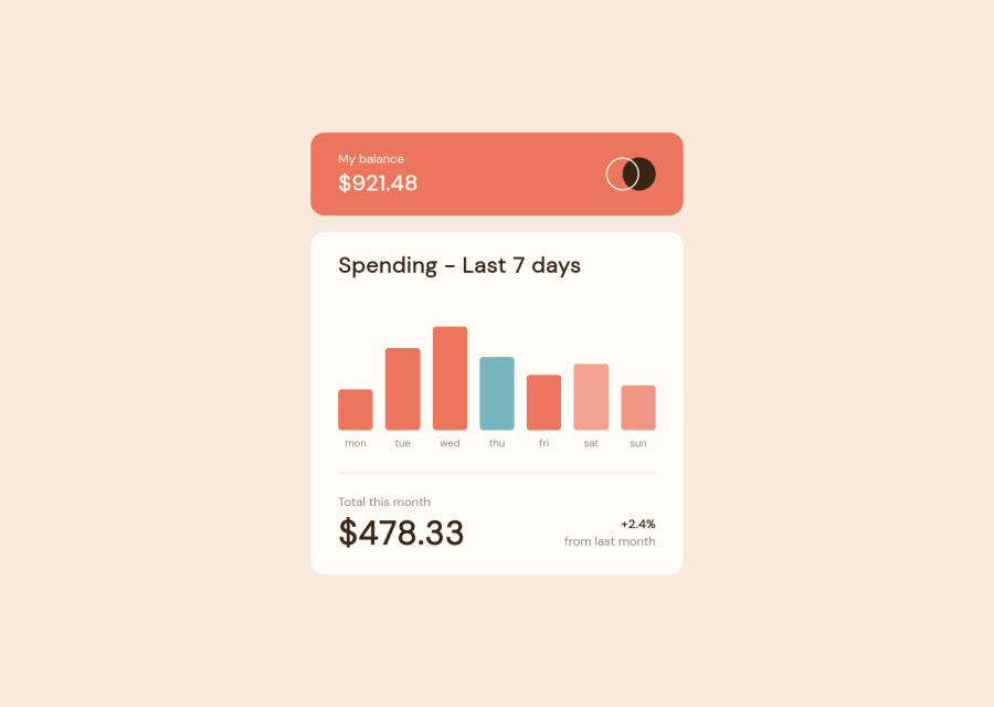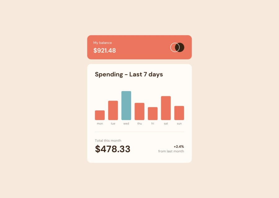
Expense Chart with Json and staggered animations in Vanilla Js
Design comparison
Solution retrospective
I had fun adding animations when the data is load via the data.json file. Feel free to give any feedback if there are some stuffs I can improve!
Community feedback
- @Aadv1kPosted over 2 years ago
The design looks spot on! just one small thing, I think the grey bar is meant for the highest value
0@remyboirePosted over 2 years agoHi @Aadv1k, thank you for your feedback ! I think you're talking about the 'wednesday' bar, isn't it ? Since we're thursday it's actually this bar that's highlighted!
0@Aadv1kPosted over 2 years ago@remyboire welp, it's just a theory, pretty cool that you implemented that, what I though that it is supposed to be a weekly expenses chart, something you might check next week, so doesn't make sense to show the current day, but it would be good to show the max amount spent in some danger (red) color
0@remyboirePosted over 2 years ago@Aadv1k I sticked to the design actually, but I totally agree with you, it's
last 7 days spending, so the actual day should be the last! But the challenge was pretty clear :See the current day's bar highlighted in a different colour to the other bars. I didn't manage to correct the design as I focused on the code :)0@Aadv1kPosted over 2 years ago@remyboire ohh okay, I actually did not see that one! While writing code I just do what I feel makes sense, I never really read the guide, but hey, at the end of the day, your design looks really spot-on, I might as well ask you for some input on my solution
0
Please log in to post a comment
Log in with GitHubJoin our Discord community
Join thousands of Frontend Mentor community members taking the challenges, sharing resources, helping each other, and chatting about all things front-end!
Join our Discord
