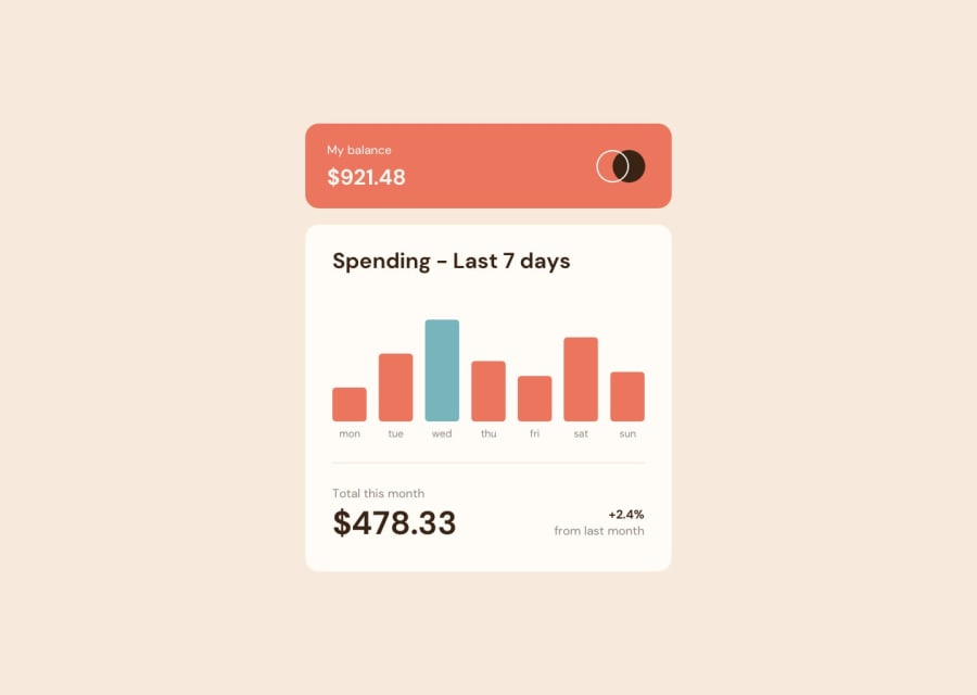
Design comparison
Solution retrospective
Only trouble i have was getting the @media screen issue below 375px AND how to import JSON file and file changes according to changes in the JSON file.
Any help would be highly appreciated. PLEASE I WOULD LOVE TO LEARN to improve.
Community feedback
- @Pulkit-s21Posted over 2 years ago
Hi Nicholas, I saw your solution and the code. You got the thing to work but to be honest the code isn't good. You used fixed height,width instead of making it responsive that's why the problem is there for you.
- Try learning more responsiveness for layouts first before doing these challenges. The best I can recommend is Kevin Powell. I was very bad at responsive layouts first but after few months and watching his videos helped me a lot.
- I saw you did two challenges in total and they were Junior Level and as you have asked the community you yourself think you need a lot of learning to do. So I would suggest first complete all newbie level challenges in HTML & CSS first then JS and then move to higher levels
- I just completed this challenge yesterday but my chart isn't visible when I upload in netlify so I didn't submit the solution but here is my repo for this
https://github.com/Pulkit-s21/expense-chart.git
If you want you can look at the code. Not at all good by any means but just for you to see how you can get it to be responsive.
Marked as helpful0@nickyczyPosted over 2 years ago@Pulkit-s21 Thank you so much! Yea that old solution was done recklessly. So to solve my responsiveness issue, i should remove the height styling in CSS?
0@Pulkit-s21Posted over 2 years ago@nickyczy Its not just the height even fixed widths cause problem to the site and there wont be short fixes to get the site running up quickly. Responsiveness takes time and well lot of learning. I see you removed the height but now if you will go into mobile view you will see the site is completely messed up because you used fixed widths and they don't change according to viewport. It will take time but keep at it and do watch Kevin, he teaches all things to get better at responsiveness
0 - @M-lakshanPosted over 2 years ago
Add JS event-listeners for window resizing. You can't import JSON files with CSS, it has to go with JS
0@nickyczyPosted over 2 years ago@M-lakshan How do you do that? Do you have an example i can refer to? I was googling earlier, and it showed using $json method in index.js but then i couldnt pass data to chart.
0@M-lakshanPosted about 2 years ago@nickyczy I'm a self-thought programmer. I can't explain it very much but considering those tutorials I've watched, the JAVASCRIPT-OBJECT-NOTATION files can't work with CSS. instead of using media screens in CSS, use JS window event listeners. They both do the same thing. They are much more narratable compared to media screens. I'm still completing the NEWBIE challenges. soon after I complete those I'll start this & show it to u. only five simple challenges left in NEWBIE.
Marked as helpful0@nickyczyPosted about 2 years ago@M-lakshan Thank you!! Ive been learning responsiveness! Thanks so much
0
Please log in to post a comment
Log in with GitHubJoin our Discord community
Join thousands of Frontend Mentor community members taking the challenges, sharing resources, helping each other, and chatting about all things front-end!
Join our Discord
