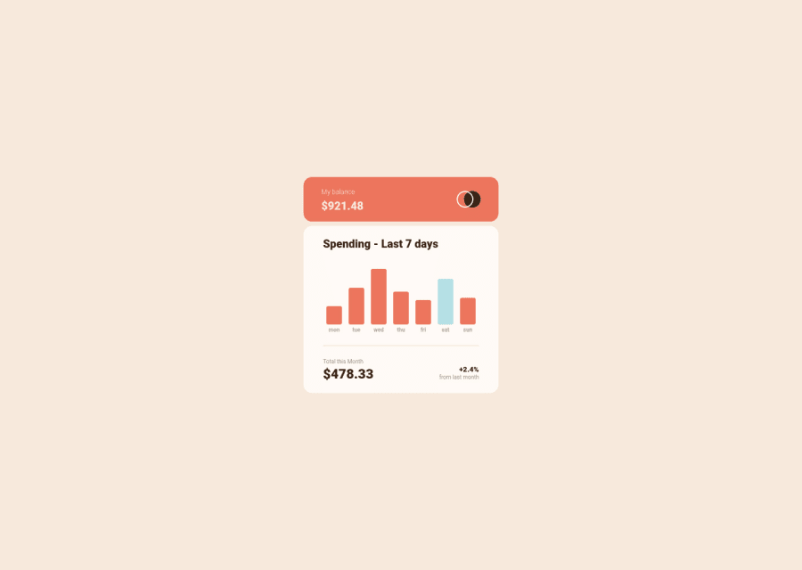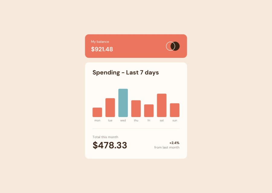
Submitted over 2 years ago
Expense Chart using vanilla javascript
@yacineKahlerras
Design comparison
SolutionDesign
Solution retrospective
any feedback is welcome 🤗
Community feedback
- @iprinceroyyPosted over 2 years ago
Hey @yacineKahlerras, You did excellent work. I would suggest some points here:
- You can use modern CSS3 features like a clamp to make fuild-typography and min, and max for the responsive width.
- Wrap the contents in the main tag right after the body tag like this
<body>
    <main>
       Your contents.....
    </main>
</body>

I hope it adds to your learning. Happy Coding :)
Marked as helpful1 - @hrk-berserker27Posted over 2 years ago
Hi there, you did a great job in completing this challenge. Here are some suggestions which will help you improve it by a notch:
- Try not to put the main element inside a section as it makes its use redundant. Try using this: <main> <header></header> <section></section> <section></section> <footer></footer> </main> It is one of many examples of getting rid of one landmark accessibility issue. Check this for more information: "https://www.semrush.com/blog/semantic- html5-guide/"
- Use heading tags such that you don't end up using different heading levels with more than one difference between their levels. Always try to decrease the heading level by one or change the size of the heading in CSS. *My tip: use only h1 and change it's font-size if you find it confusing to use other lower levels of headings.
Marked as helpful1@yacineKahlerrasPosted over 2 years ago@hrk-berserker27 thanks man appreciate it !
0
Please log in to post a comment
Log in with GitHubJoin our Discord community
Join thousands of Frontend Mentor community members taking the challenges, sharing resources, helping each other, and chatting about all things front-end!
Join our Discord
